

Here's a look at some photos I took at this Rite Aid location which lies on the east side of the city of Erie.
 |
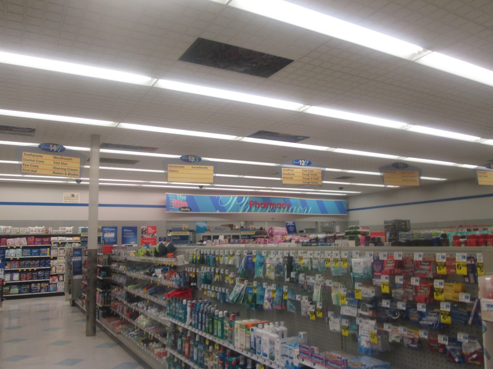
| That pharmacy text format reminds me a lot of the same format that Kmart uses. |


So there you go. Another look at one Rite Aid's older designs.
Thanks for the link! I also photographed the other DeSoto County, MS, location (on Stateline Road in Southaven) recently, but it won't make it on the blog until this summer at the earliest. Looks the exact same as the Horn Lake store and this Erie store inside though!
ReplyDeleteI agree, I've always associated that font with Kmart. The more frequently I see it though, the more I think it must have been a font of the era, a lot like you'll see a lot of those narrower, skinny fonts everywhere from promotions to newscasts to, for example, SNL these days.
Nice! I'll be keeping an eye out for that. I'm not surprised to hear that the decor is the same. Seems like Rite Aid doesn't focus too much on stores down your way.
DeleteI suppose that font might have been rather inexpensive to use at the time as well making it more common. I've just seen it used at so many different Kmart locations, I just assumed Kmart was the only one to use it!
This comment has been removed by a blog administrator.
ReplyDelete