Fittingly, 'a whole lot of awesome' has apparently been made to a Kmart in Des Plaines, IL. What I mean by that is that Sears Holdings actually remodeled the interior of this store to attract customers. While the interior has changed, the exterior remains the same. While I don't mind that fact too much, it is still kind of odd to have done that. I really shouldn't be surprised by that with Sears Holdings' track record. They seem to always find something to skimp on.
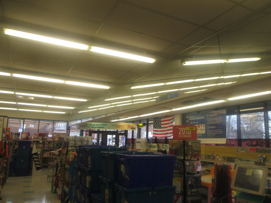
Regardless, this is fantastic to see that an effort has been to improve not only the fresh food selection at Kmart, but also the store's aesthetics in general. The press release indicates that wider aisles and new signage are found within the store. The customer services desk and pharmacy have been redesigned to better accommodate the customer's needs. Also added is a 'Shoparazzi' express lane (as seen in the customer services linked photo). Shoparazzi is "a free personal concierge service that when provided a member's list, will do the shopping for you. And if Kmart doesn't carry the product, they will find it at another store and it will be waiting for you at checkout."
It is also great to see a paint desk introduced, something of which has not been in any post-Sears merger store. It is also fantastic to see a better selection for pet products. I applaud having appliances, mattresses and furniture all next to each other. Freeing up space in front of layaway for excess products is a smart move. It gives the impression of items that you could be putting on layaway, yet at the same time gives more room for any departments that need the extra space. Also notice that this is where a display of movies has been moved to with the electronics department shrunken down. The main aisle for dollar deals and the "Aisle of Wow" are a nice to touch to give the customer a feeling of scoring good deals which has been one of Kmart's new goals.
A couple of negatives I find with this package, is the fact that electronics is only one and a half aisles. I realize that electronics has been a weak spot for Kmart in the past, it still is disappointing to see them shrinking their selection rather than improve upon it. The other fault is the fact that the store removed it's eatery. This store previously held a Little Caesars as seen here, but it was removed in the remodeling of this store to be replaced with shoes. I know that the Little Caesars found in some of the Kmart locations within the Twin Tiers coverage area appear to be busy and they draw a crowd into the store.
And while I assume this empty space is temporary, why is it here during a grand re-opening celebration?
You can see a whole photoset of what the store looks like now and what it had prior. The linked pictures of this new and so far unique to the Des Plaines store decor package known as 'Whole Lotta Awesome' come to you via Flickr user fourstarcashiernathan.

Wednesday, August 31, 2016
Monday, August 29, 2016
Kroger; In the Northeast?
--------------------------------------------- NEWS STORY ------------------------------------------------------
In a rather interesting turn of events for the Walgreens/Rite Aid merger, Kroger has evidently expressed an interest in buying some of the excess stores that will be created once the merger FINALLY goes through. This news is actually rather interesting because it not only brings Kroger into the northeast, but also creates the possibility of a new prototype for the company.
The question is (assuming the deal were to go through) would Kroger operate a smaller supermarket within or just run a Kroger-branded drug store chain?
Being right in the middle of it all, I may just have a front row seat if Kroger does indeed get access to the 500-1,000 locations expected to be sold off.
http://www.bizjournals.com/cincinnati/news/2016/08/29/kroger-could-be-looking-to-snap-up-walgreens-rite.html?ana=yahoo&yptr=yahoo
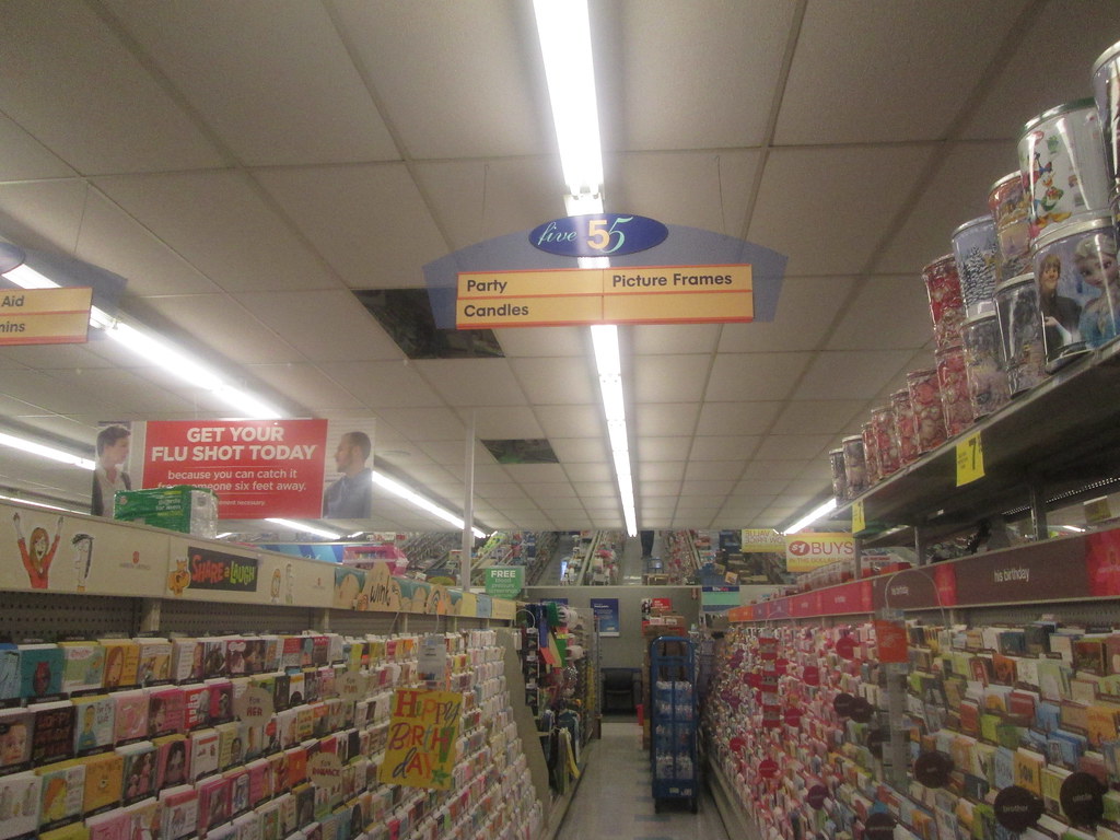
The Hometown Rite Aid Design

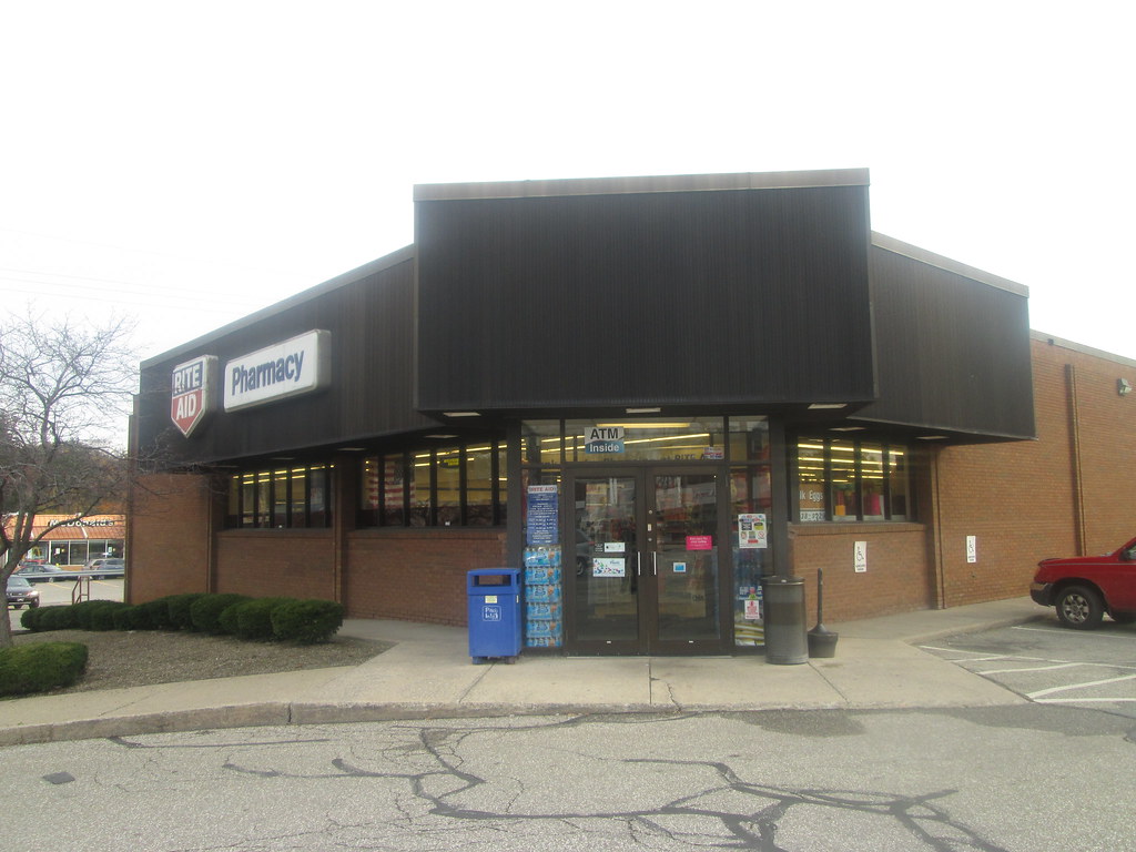 |
| These hometown stores are often the same style found in urban areas as well. They are smaller than the typical store by probably around 3,000-4,000 sq. ft. making them ideal to take up less real estate. |
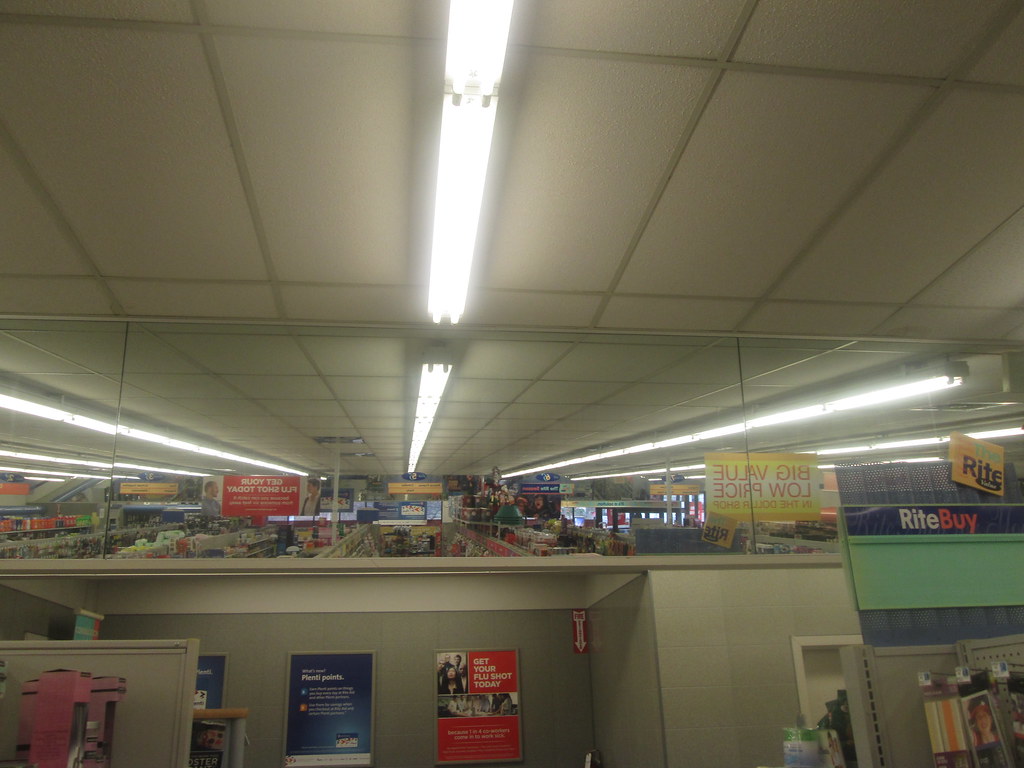 |
| The wall mirror in the back is one the major differences. |


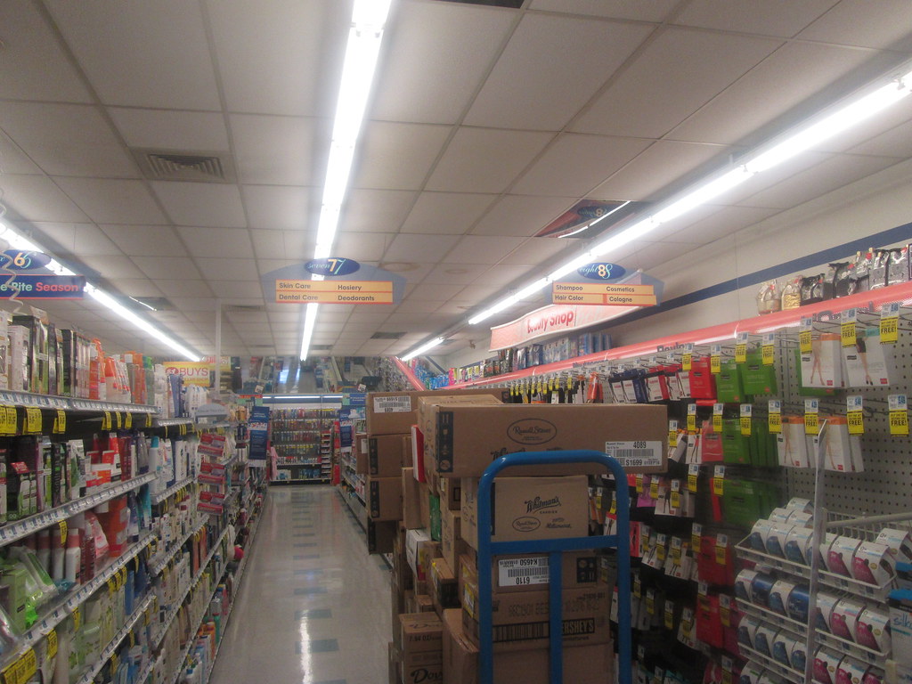 |
| While the exact number of aisles may vary, usually I would assume there to at least be 6-9 aisles. This store had 8. |
 |
| I'm uncertain to whether this is a part of the architectural design or if this roof peaking upwards is unique. Any urban locations likely do not have this however. |

So there you have it, another decor package covered.
Monday, August 22, 2016
A Black and Blue Walmart 2.0

Walmart's Black Decor 2.0 is finally making it rounds to the Twin Tiers coverage area. Having stumbled upon a store in Clarion, PA with the new paint colors, I ventured into said store hoping to see the new decor in person. Expect I walked out disappointed that the decor on the inside was still Project Impact. So, upon knowing that this store in Montoursville had too received the new exterior, I figured I'd check it out. I wasn't holding very high hopes after that other store's experience. Thankfully, this store wasn't a waste of time as it did receive the new decor package.
While I have seen the decor in pictures via various Flickr users, I didn't want to make a final judgement until I saw it in person. I must say that this decor is a major step up from Cheap Impact, despite being of the same quality materials used for cheap impact. The problem I have with Black Decor 2.0 is the exterior paint job on some styles of supercenter locations. In my opinion, it just looks very ugly and unwelcoming in these particular designs.
 |
| Black Decor exterior on the Clarion, PA Walmart |
Having the paint job on a smaller store like this one, which is obviously not a supercenter, doesn't look bad to me at all. I guess I like the fact that the blue actually highlights both the entrance and the Walmart logo in this instance.

Interior time:

 |
| The store has the same layout from before. |

 |
| Since this store is basically Williamsport's Walmart too, little league traffic is expected. (That is if they don't go to the closer Kmart store first....) |


 |
| Corner photo lab. |

 |
| Pick up your Toys! |
 |
| Linin' Up the Cars |


 |
| Part of the sporting goods sign is cut out for the stockroom door. |
 |
| Old Days of Walmart Pride |


 |
| This particular sign is probably unique to non-supercenter stores. |

 |
| Produce in the main actionway. |


 |
| At least you're being thanked for shopping at your particular local store again. |
Looking forward to seeing this come to my local store.
Subscribe to:
Posts (Atom)