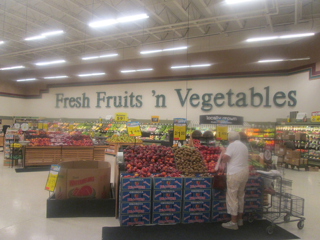
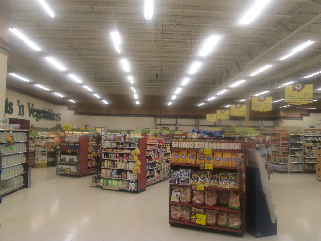
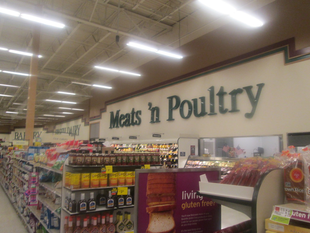
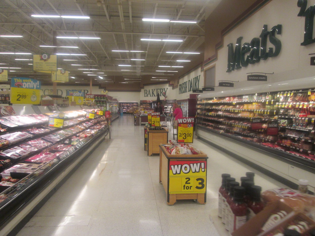
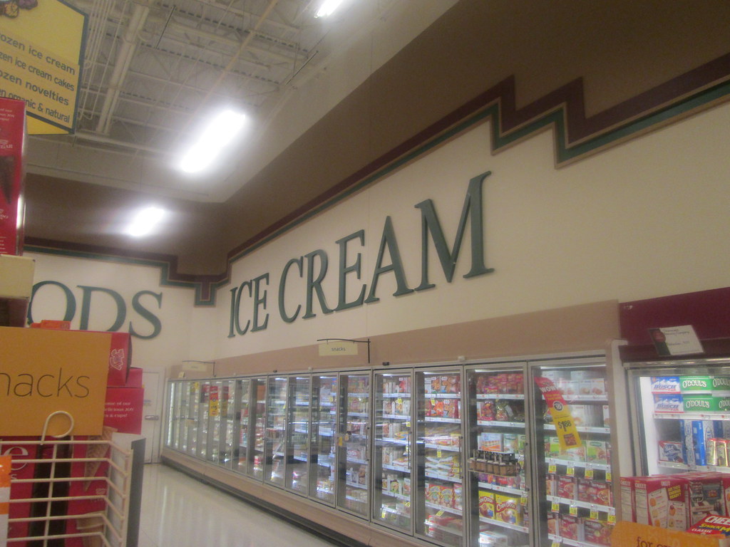
Today's tour takes us to perhaps the most unique supermarket I've stepped foot into. Apparently the fact that the decor is quite simple and plain with just letters over the various departments make its special for the Hannaford chain. But what is far more interesting to me is that the store is layed out much differently from any other supermarket I visited because all the aisles are horizontal.
Hopefully this map will help you better understand the layout:
The tour will pretty much follow the perimeter of the store.









I do know one former Hannaford turned Kroger (since relocated) that had a vertical footprint, sandwiched in between a Target and Home Depot. Perhaps it had such to better fit with said layout, just something along those lines.
ReplyDeleteGreat work anyhow.
That sounds like a case of them inheriting the location and Kroger was stuck with it. Must be that Hannaford was built with aisles intended to go that way. Also sounds like that would of been a unique location as well.
DeleteThanks!
Cool design..how many square feet is the store?
ReplyDeleteThe entire plaza (not counting the former Kmart soon to be Runnings) is just shy of 70,000 sq. ft. Best guess would be that it is somewhere around 50,000.
DeleteThe simple décor is from when they were branded as Shop 'n Save. It is possible the layout may also be a leftover from the Shop 'n Save era. This is an endangered species as stores that are more updated are being remodeled, so there's no telling if that might be happening as we speak.
ReplyDeleteThat explains a lot. Interesting though they didn't opt to update this store when it changed banners.
DeleteAlso of curious note; the one in Massena (which originally opened in 1991 as Sun Foods and closed in 2017) also had this kind of horizontal layout, however Hannaford gave it the Festival décor package and brown vinyl tile to match.
Delete