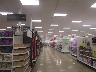
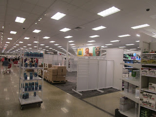
As Target expands, it occasionally will repurpose former stores that were left abandoned. This post shows the former Kmart in Lakewood (near Jamestown, NY) converted into a Target. Funnily enough, this was actually something fellow blogger Albertsons Florida Blog once predicted years ago out in a comment.
For the most part, Target overhauled the space. However, to my surprise, there were still some minor traces of the building's past- the most obvious of which was part of the garden shop windows still intact. The other notable thing was the restrooms (although remodeled to be walk-in style) being in the same spot to left of the main entrance upon entering. It seems that the CVS pharmacy was shifted slightly to the left instead of being in the same spot as Kmart's pharmacy. For comparison, a map of the building is below for both Kmart and Target:
All in all, it was nice store to see in person that I will likely occasionally visit in the future. It felt weird, but in a good way, to see a Target with a different floor plan or store layout. This makes it stand out among other locations in the region that basically could be a clone of another location. Given that this location is still over an hour and 15 minutes away from where I reside, I am still holding on to the hope of seeing a Target come to the next more populated city to the east in Olean.


I agree this is a really good location for Target, so I'm glad they took my advice! :)
ReplyDeleteWhile most of the building was gutted, it is interesting seeing those few Kmart remnants that remain, like the garden center windows. I know Target was trying to give store pickup its own space, but it still seems odd that guest services is all the way on the other side of the building from the remainder of the main registers.
I know the new grayscale decor isn't super exciting on its own, but I think it looks much nicer in new stores and older stores where a more intensive remodel is given, as it looks better with the additional lighting and fixtures it was supposed to have. Overall this is a very nice store that cleaned up this building well, and even though it's still a bit far from you, at least your Target runs won't be as far as they were before!
It does seem strange, but probably the idea was to have the guest services and online order area together to save space. The decor is nothing overly special, but good enough as a modern package. It is indeed nice to have a location closer to home.
DeleteThis layout is used extensively in Southern California. The idea is customers who want to get a few grocery items can get in and out and those who have pickup orders can do the same.
ReplyDeleteMakes sense from a convenience point of view.
DeleteGreat photos, and very interesting store! Besides the remnants you mentioned, I am also intrigued by the layout, which the other comments have touched on, too. It seems very unusual for a Target to have softlines in the center! And I agree customer service being so separate from the registers is strange too, but works well with the separate entrance on that side as well as the garden center windows and proximity to the Pickup staging area (which I imagine is using the rest of the garden center floorspace).
ReplyDeleteHaving visited the Outer Banks Target, (itself also a former Kmart) it would seem that having apparel in the center is the new thing for Target. I also figure the remaining garden center space is used for pickup purposes.
ReplyDelete