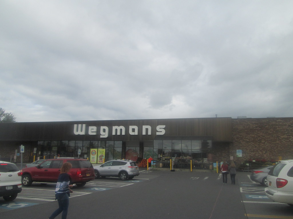
While most of Wegmans' stores are of the giant hypermarket design, there are still a couple left that aren't so big in operation around their home turf of Rochester, NY. This store, along with a store in East Rochester, would be the main two stores that I refer too. Unlike the linked store, this store appears to have done very little to update the location since likely opening in the 1970s. The only changes that would appear to have been made would be store decor updates.
 |
| Picture credit to Google Maps |
Probably the biggest reason for the lack of changes or updates would be that this location is landlocked with no room for expansion as you can see from the satellite view above. Regardless, this location appears to very well.
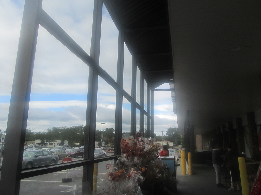
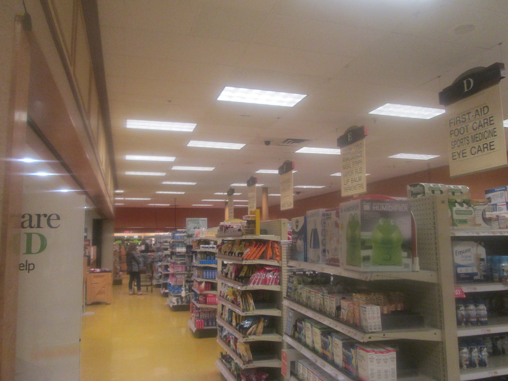
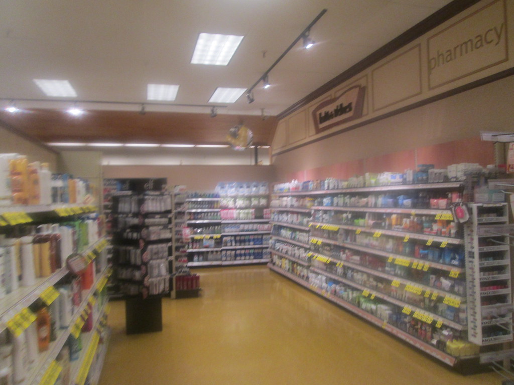
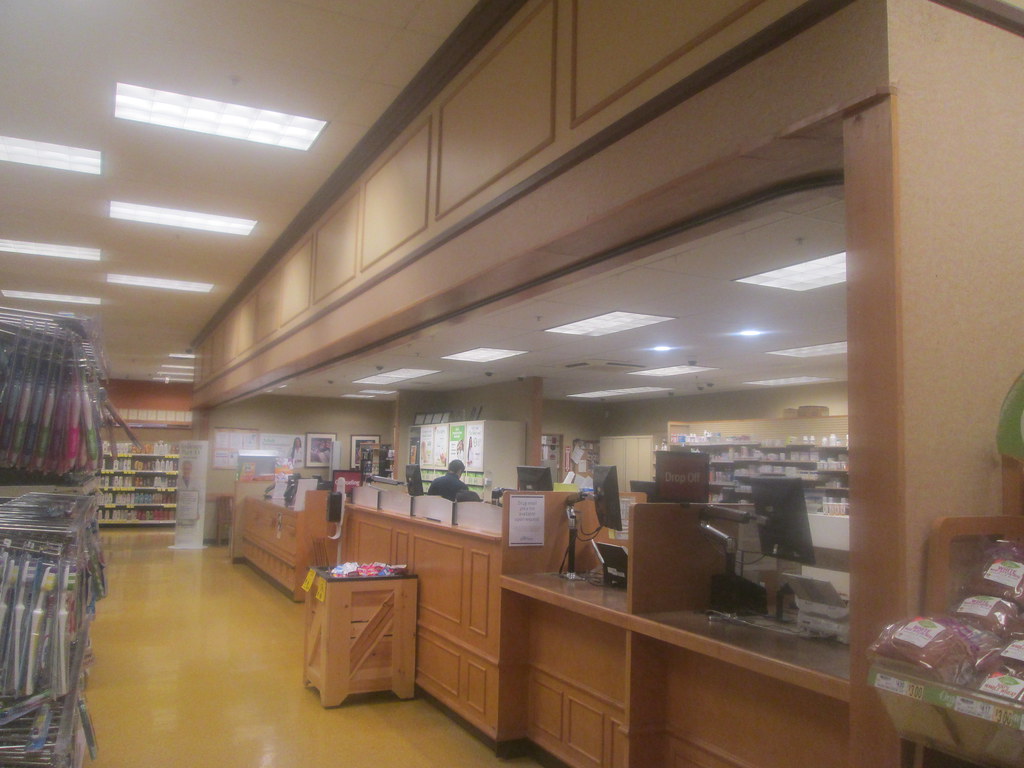
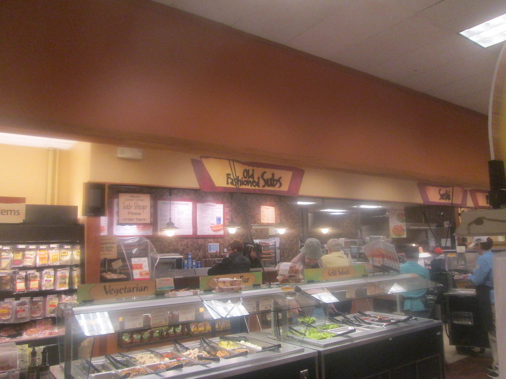
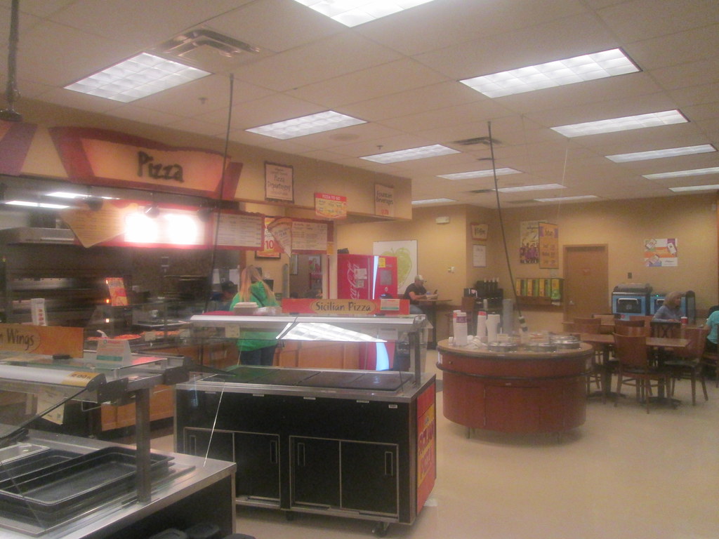
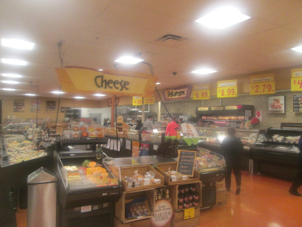
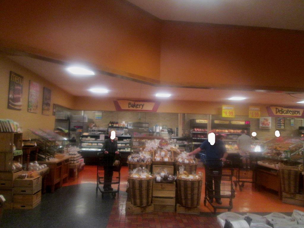
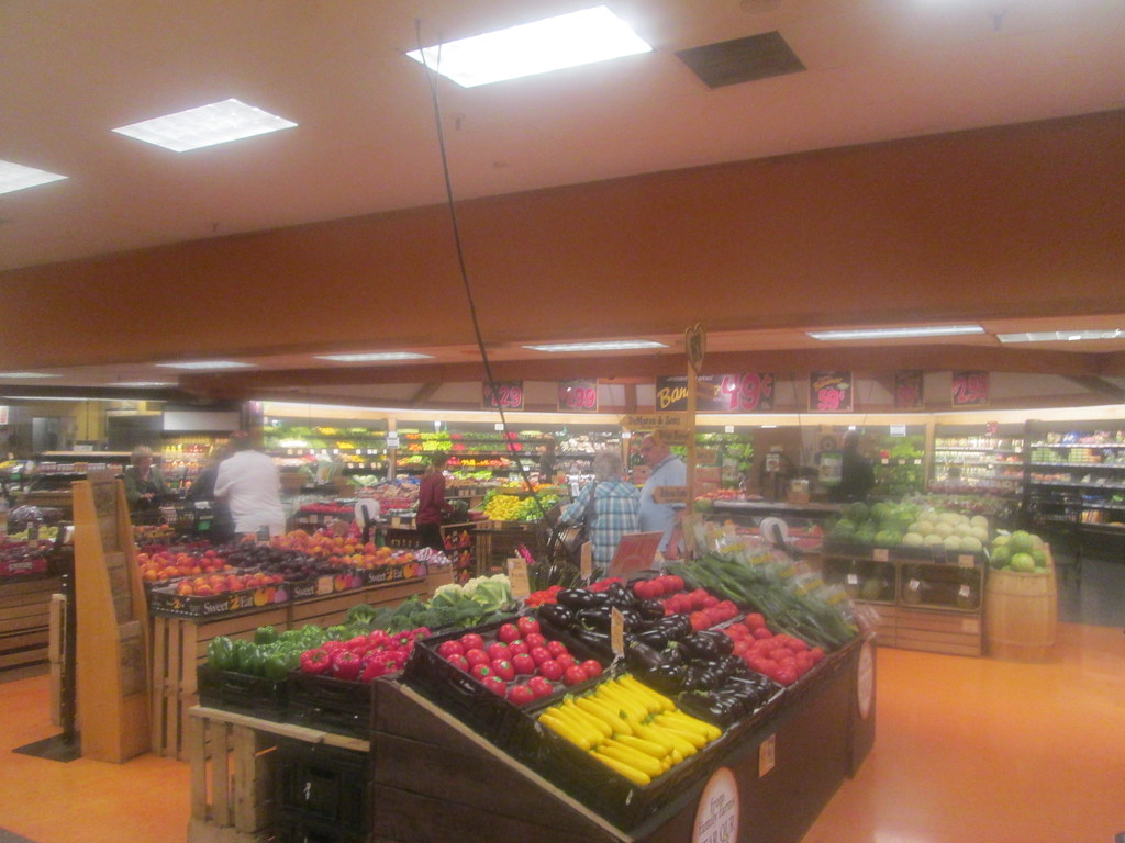
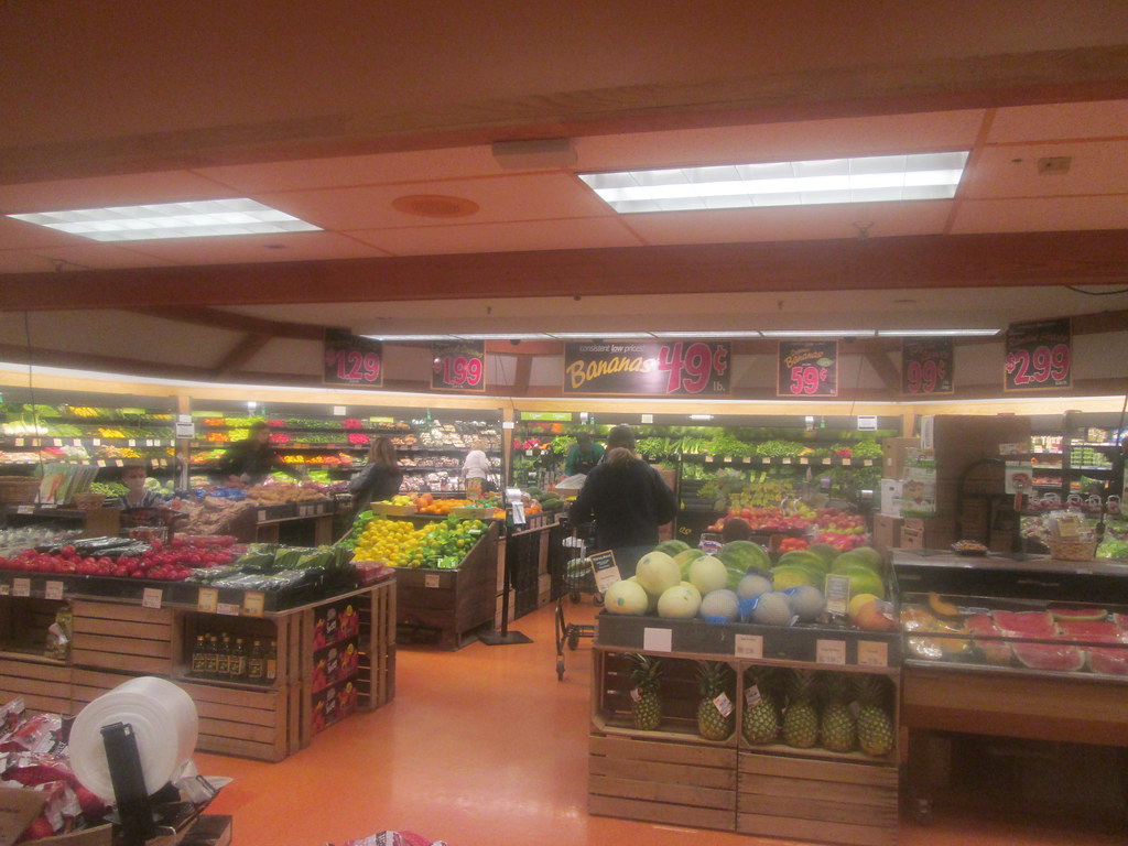
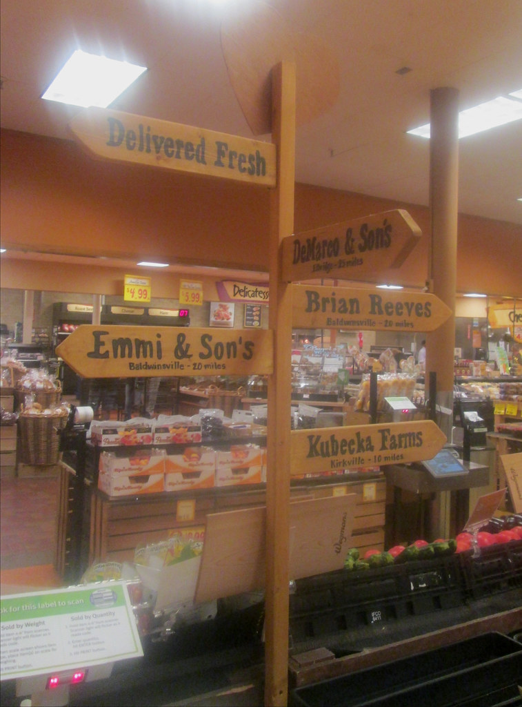
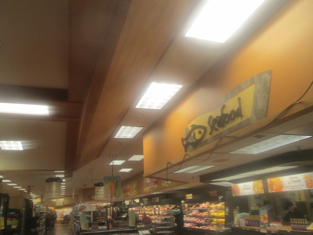
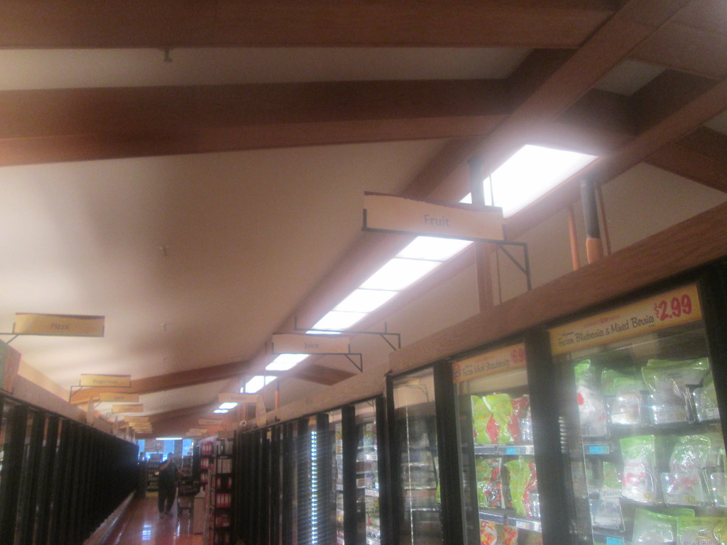
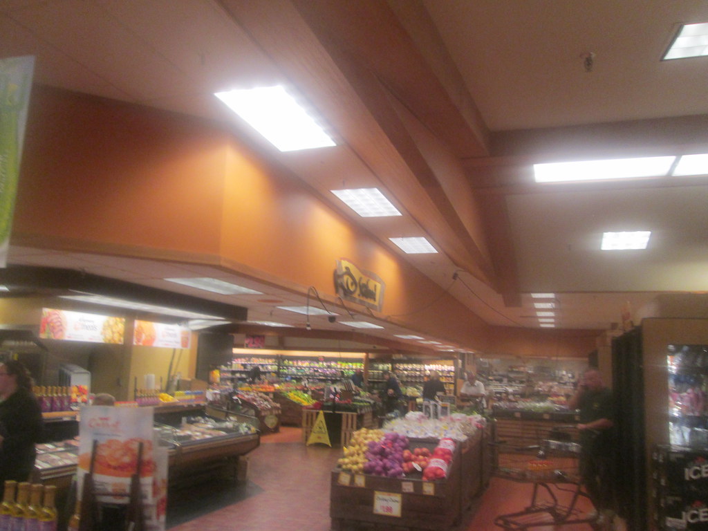
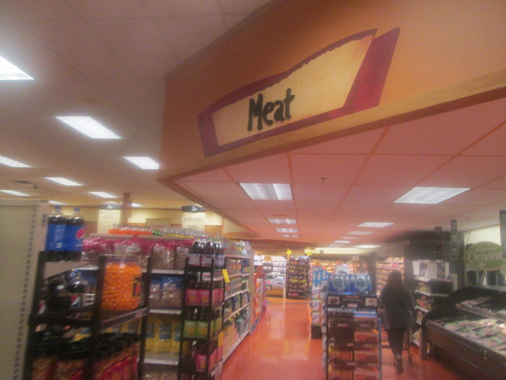
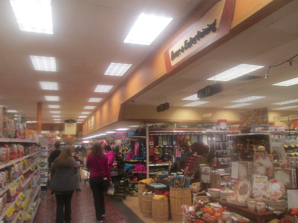
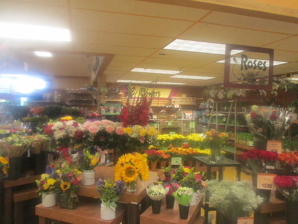
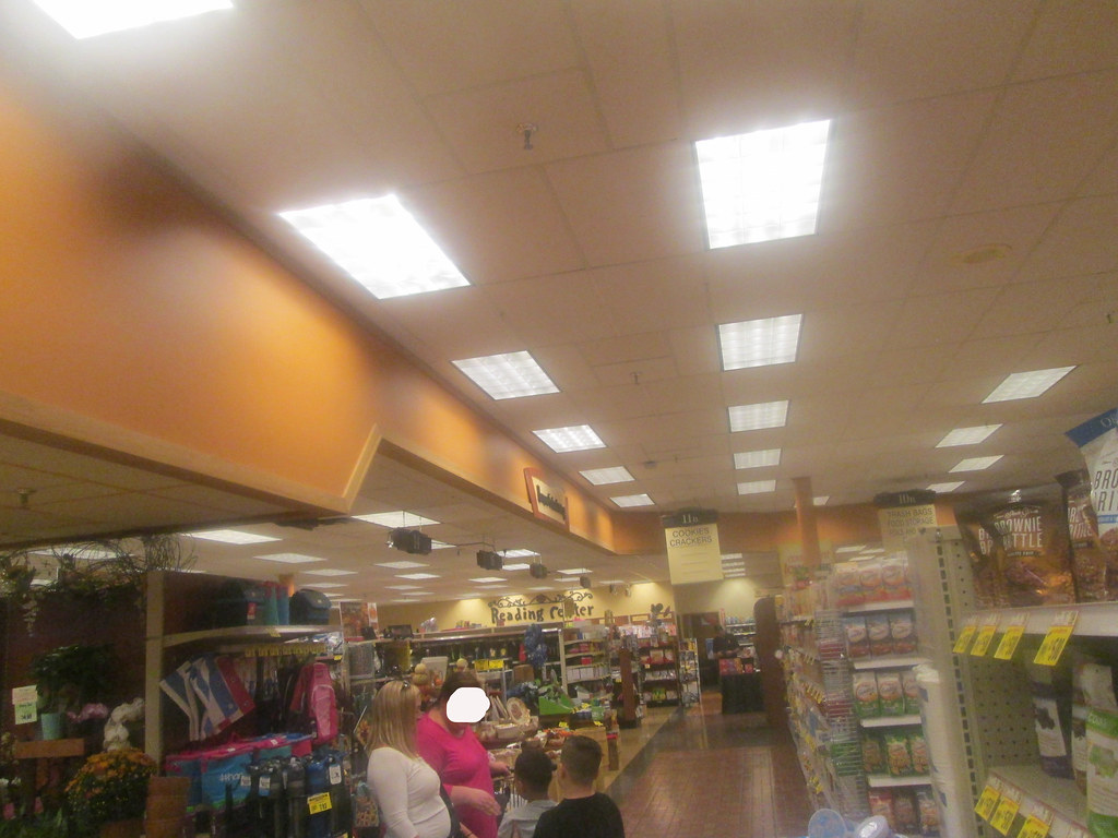
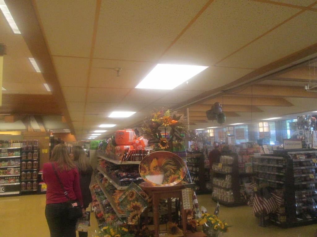
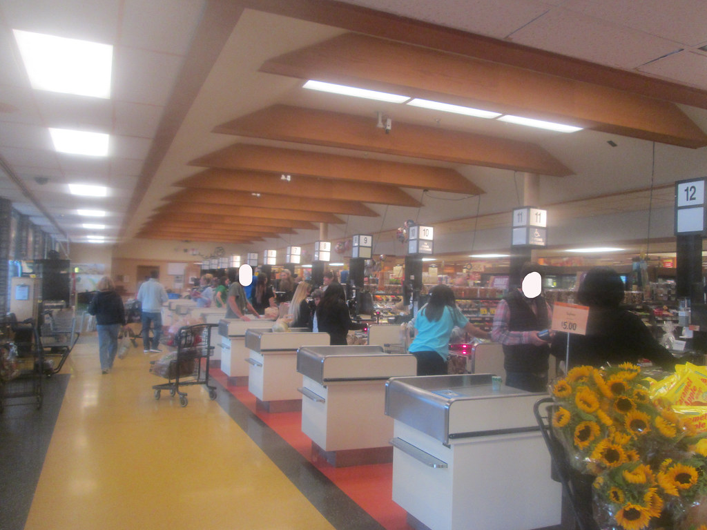
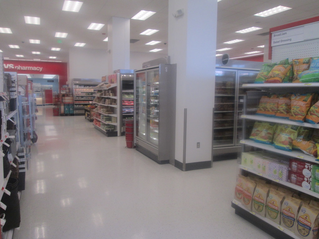
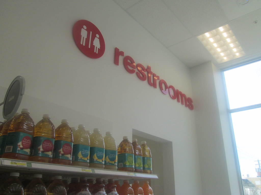
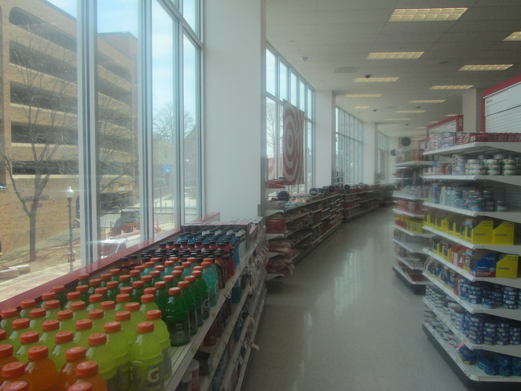
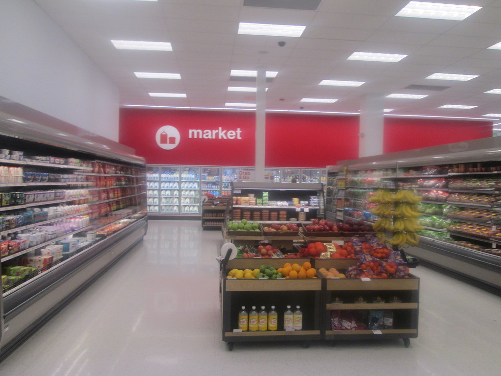
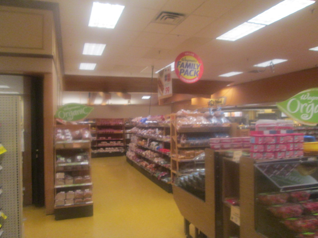
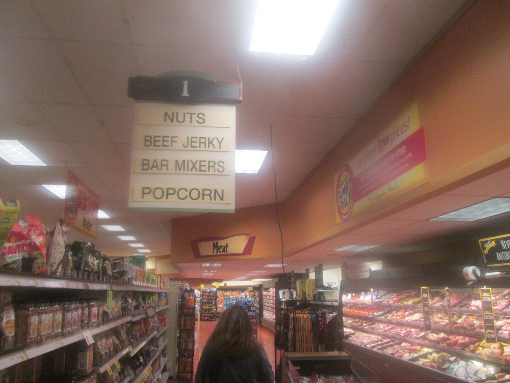
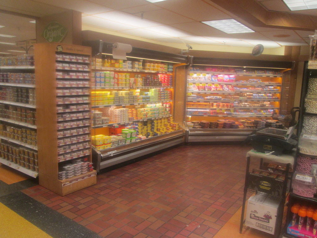
The layout of the store consists of HBA, pharmacy and the specialty food departments like deli and bakery on the right side of the store, along with a seating area. Produce is in the back right corner with meats and seafoood taking up the back wall. Dairy has a very unique feature at this store which I'll discuss below. The left side of the store has natural foods, bulk foods and some other snack items. The front of the store contains the seasonal, home decor and book departments and obviously the checkout lanes.
 |
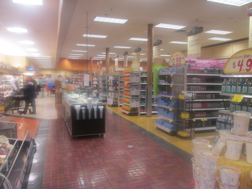
| Looking Along the Right Wall |
 |
| The pharmacy is to the left here. The bakery would be behind me in this view. |
 |
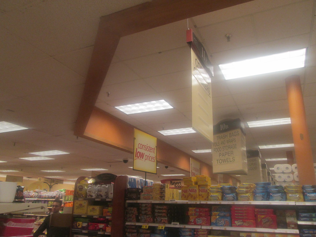
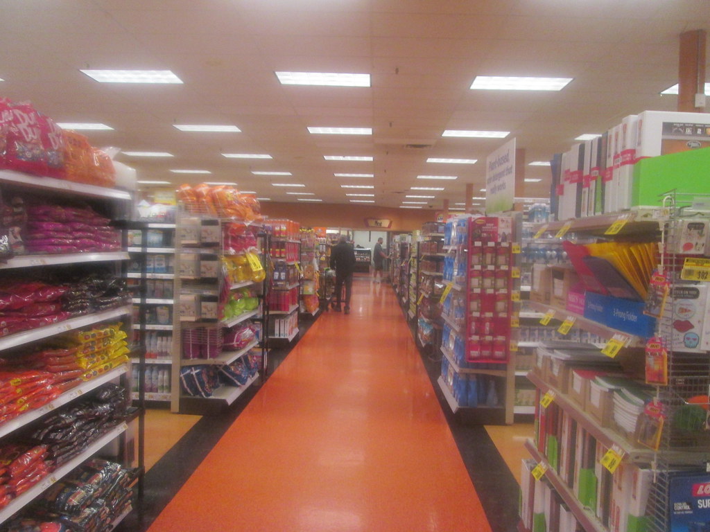
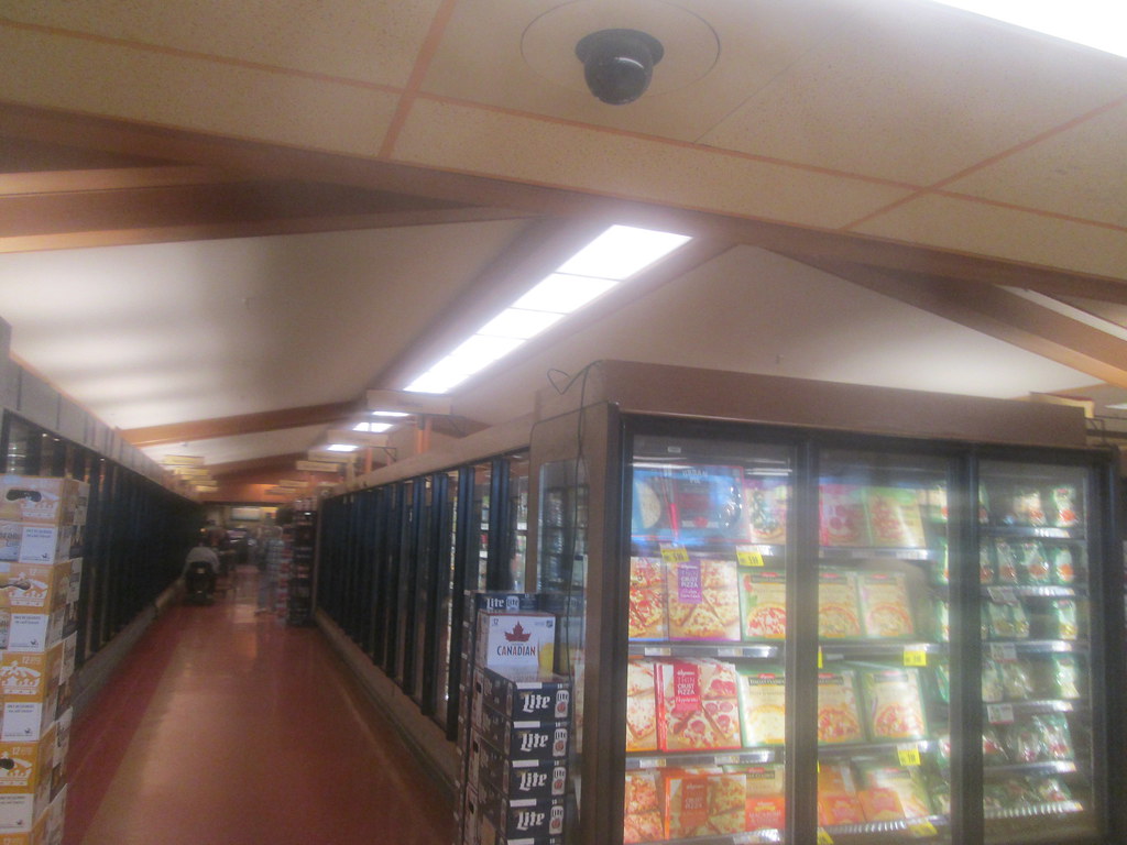
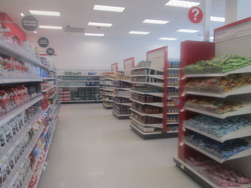
| Another interesting thing found here is that at least some of the dry goods aisles run parallel to the back wall. |
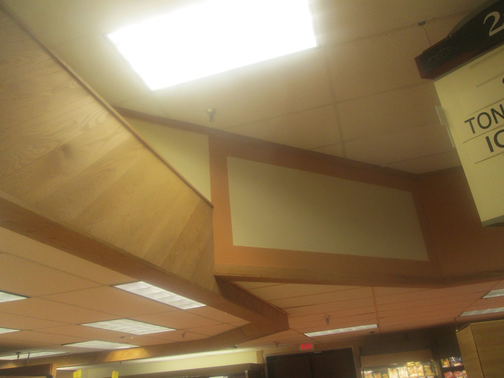 |
| Probably my favorite architectural feature is this thing right here. |
I mentioned earlier dairy has a unique setup. The reason being is that dairy products follow an aisle that wraps around bulk foods. Sounds confusing, doesn't it? Well hopefully the pics can explain it better.
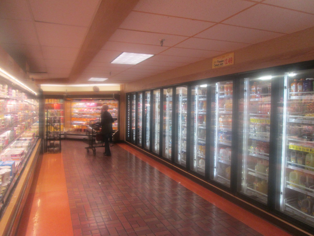 |
| Notice coolers on both sides of the aisle and how the aisle turns in the background. |
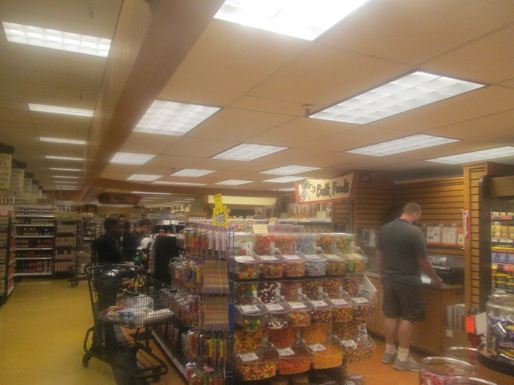 |
| Bulk foods section |
 |
| And here's where the aisle ends up - on the other side of bulk foods. |
This really was a cool idea and stands out as something unique among supermarkets.
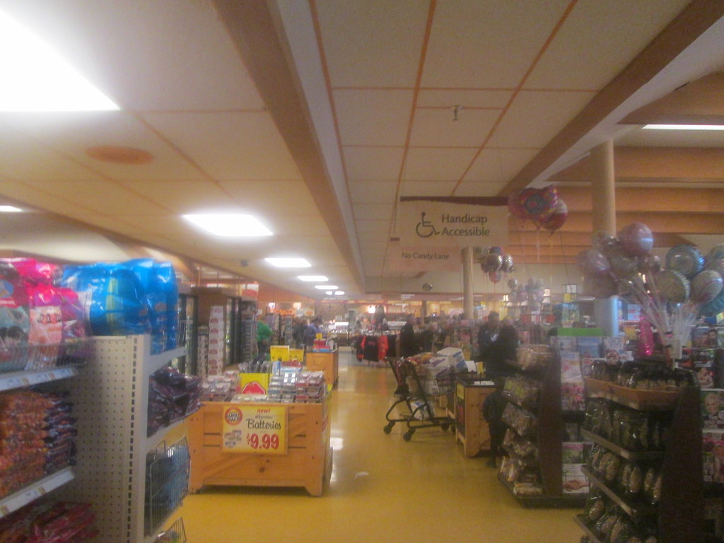 |
| I get a kick out of the 'No Candy Lane' sign |