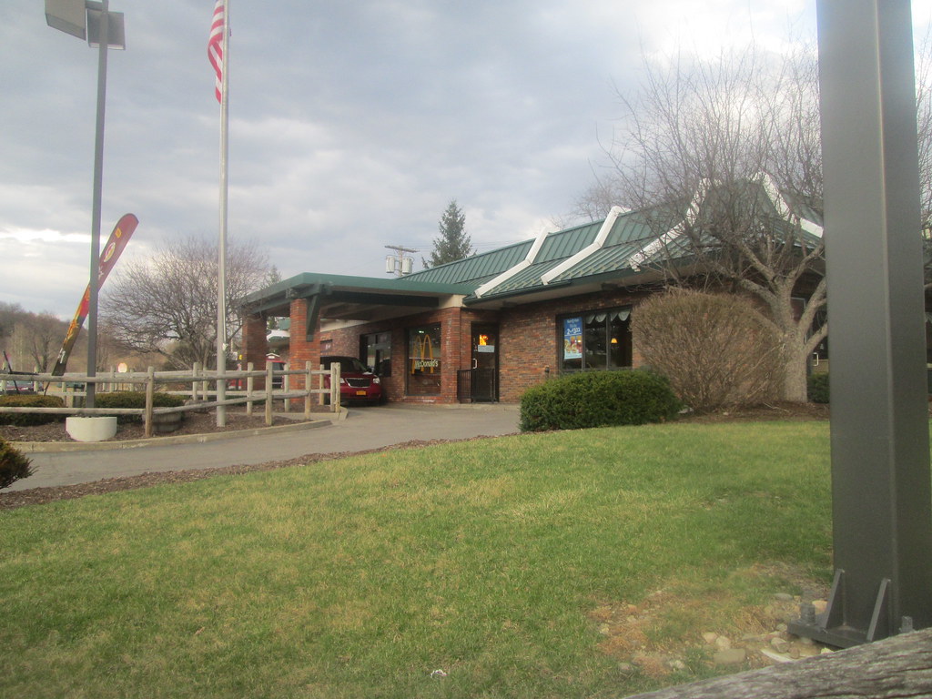
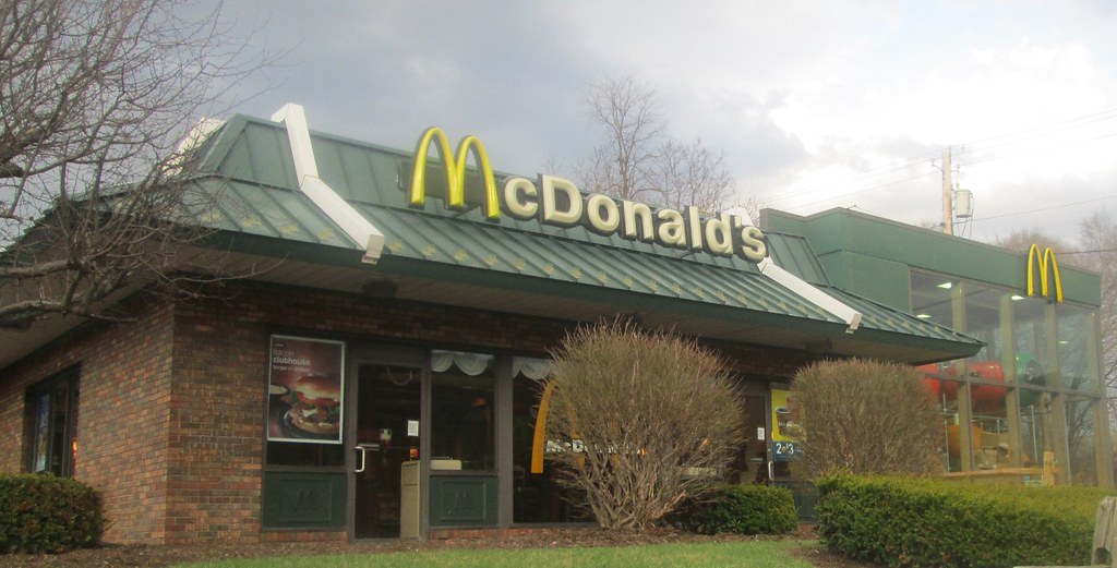
This location sits adjacent to a parking lot for a rather new Tractor Supply and Save a Lot. Those two businesses were previously a P&C market and an Eckerd location. Rite Aid did not take over this location.
Because this McDonald's location sits at edge of the property and the playground area protrudes from the building, the drive-thru is not your typical go-around-the-building drive-thru. Instead it loops and one must watch for pedestrians as they enter the only possible entrance to the building.
 |
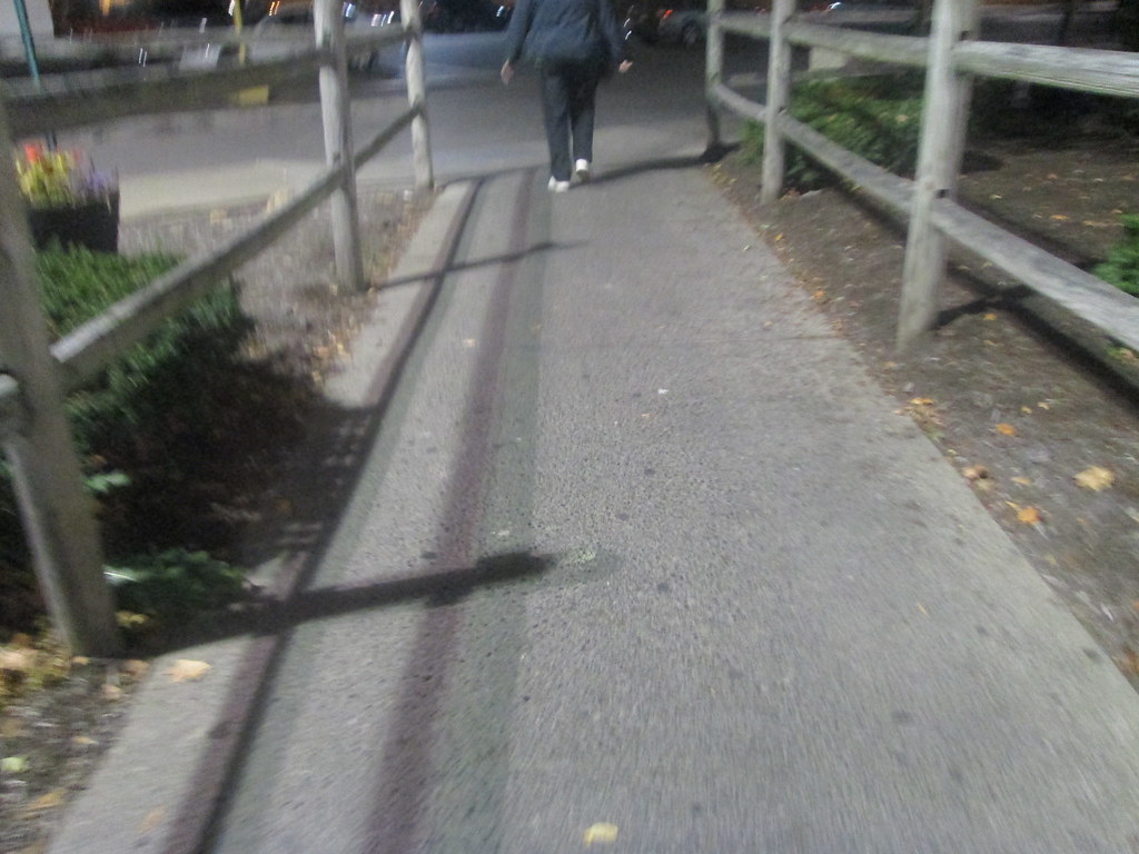
| A path runs between the fences on the left to allow interior access for customers. Below is a night-time picture of that path between the fences: |
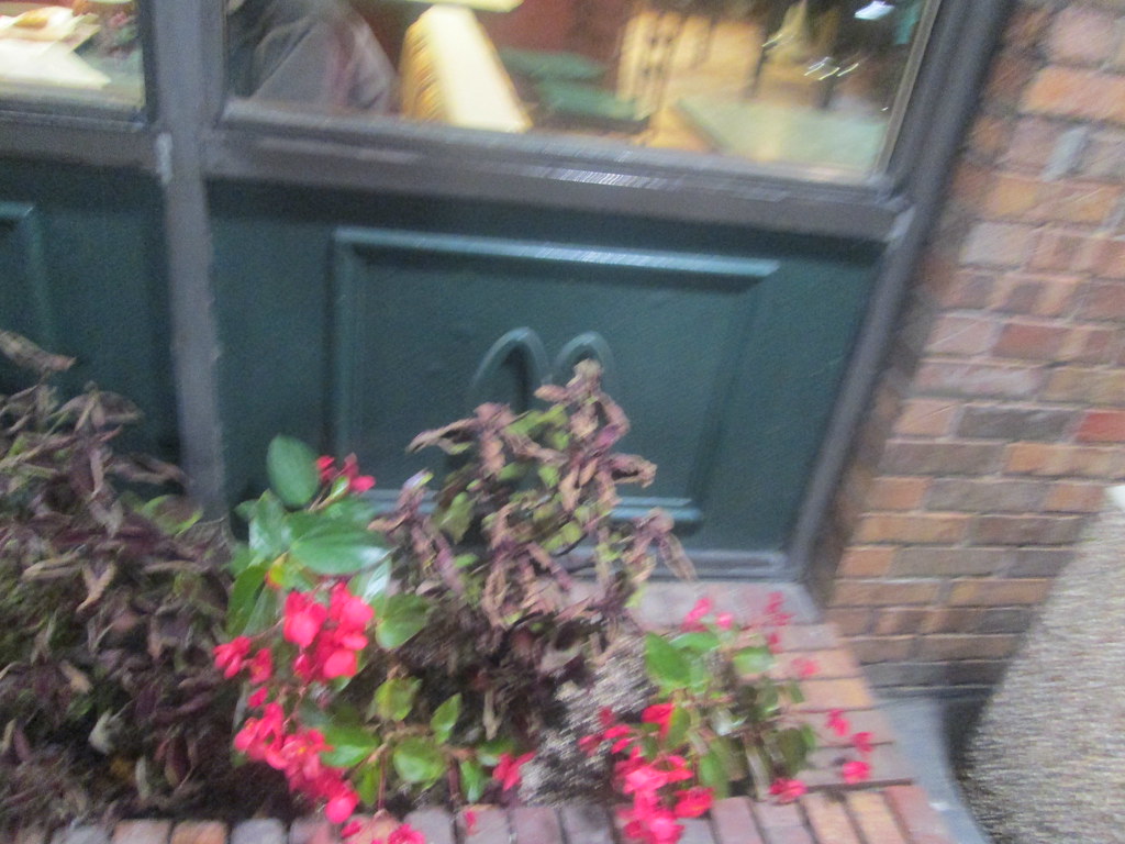 |
| Another classic feature is the arched 'M' on the lower panels of the exterior windows. As you can see, they are somewhat blocked by shrubbery at this location. |
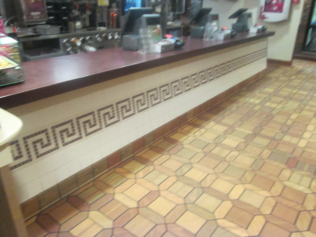 |
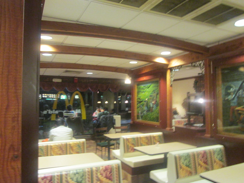
| Note the VERY classic floor tiles here. |
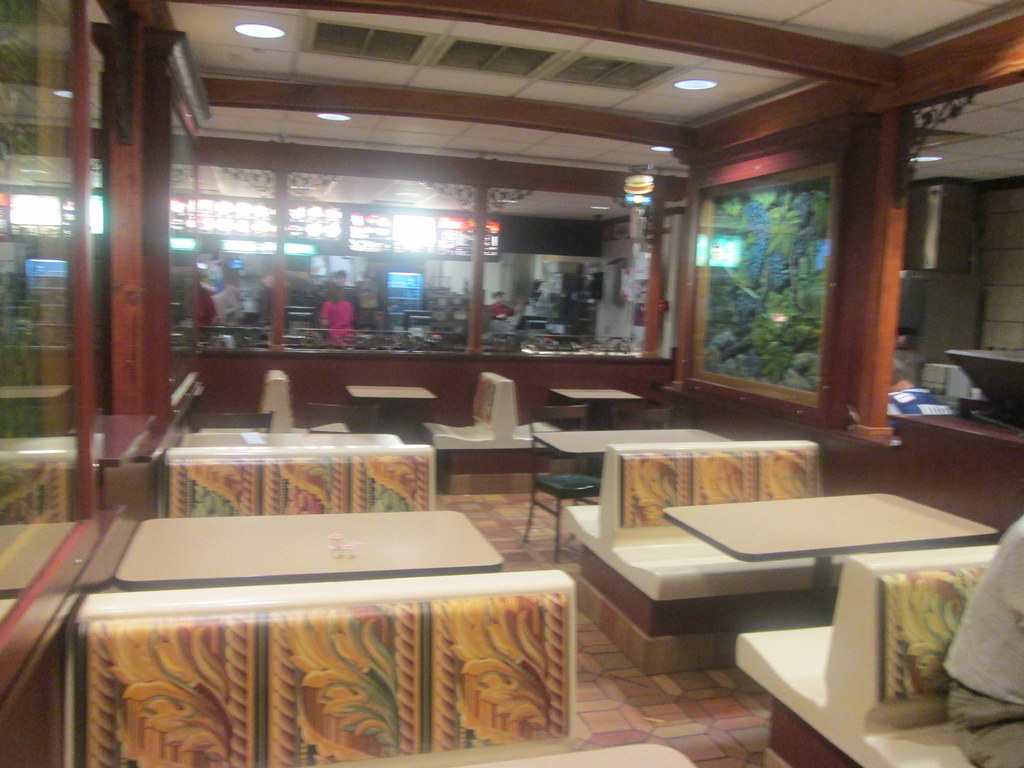 |
| I do like the woodwork to give this location a personality. |
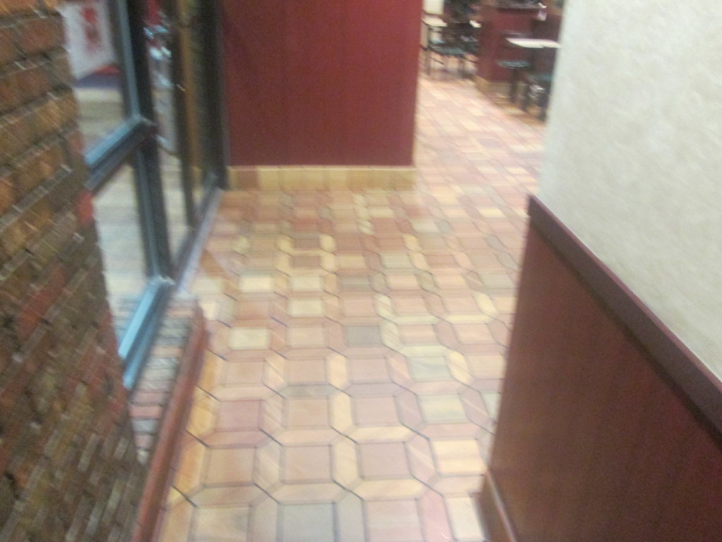 |
| A rather narrow hallway leading to the restrooms. |
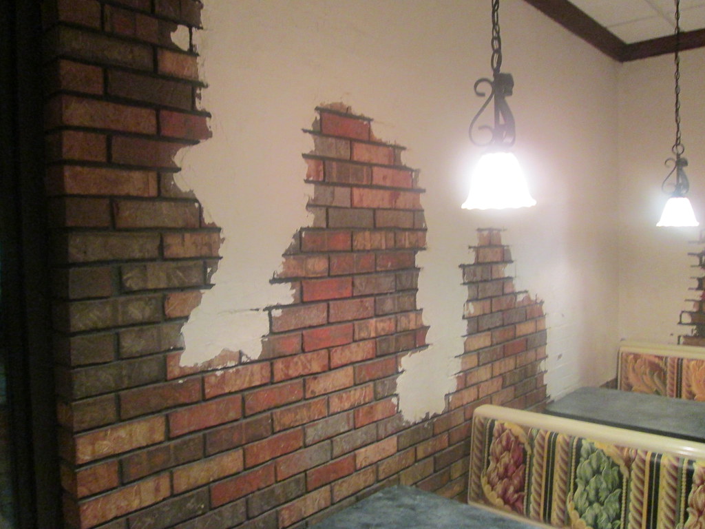 |
| Splashes of paint on a brick wall. |
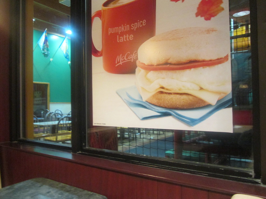 |
| 1. This window is odd. |
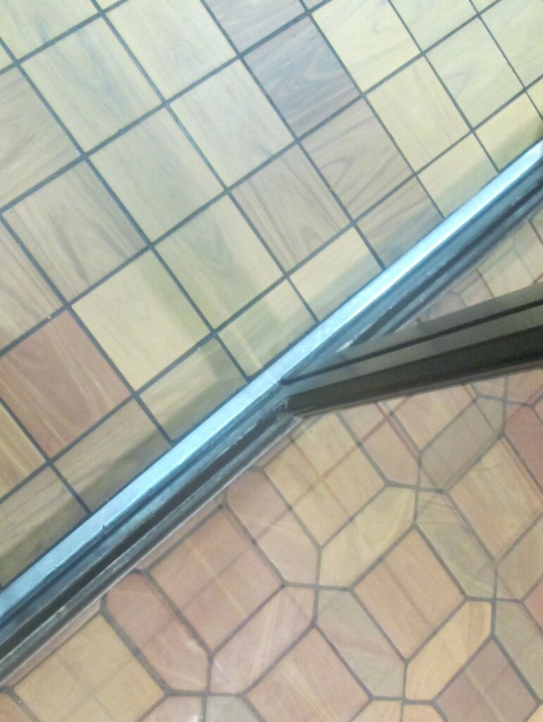 |
| 2. Different Floor Tile |
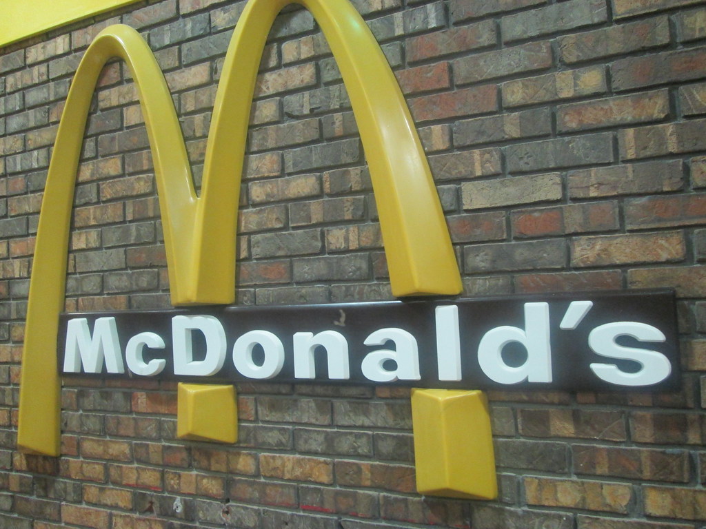 |
| 3. Inside Out logo |
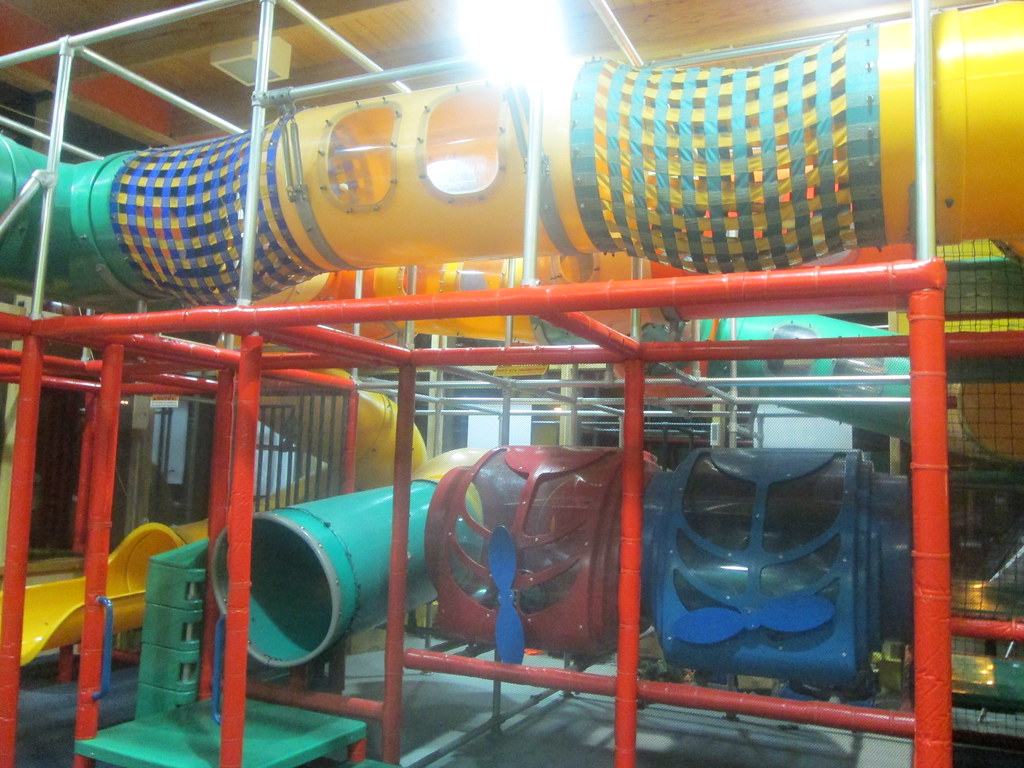 |
| A look at the ever more rare McPlayplace. |
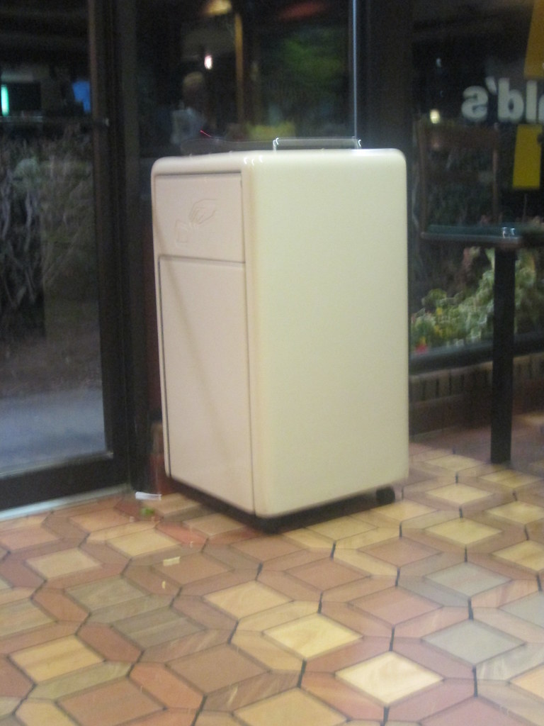 |
| Retro garbage can. |


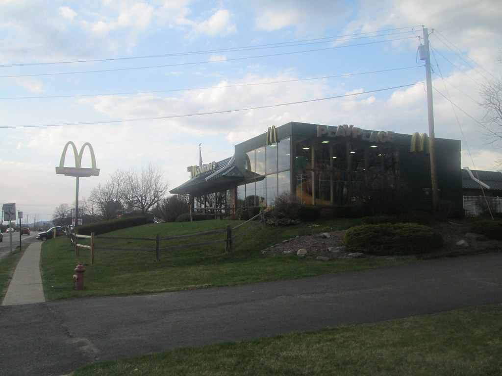
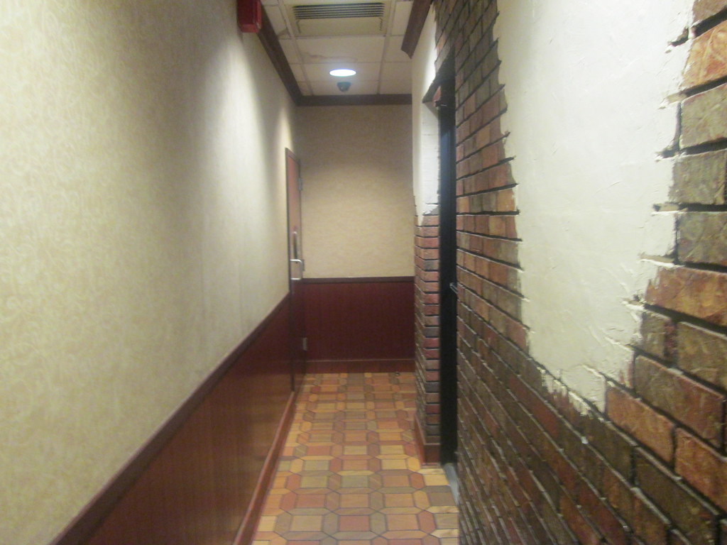
I definitely agree that this location had the playground added on at a later date! Love how they kept the exterior McDonald's logo on the exposed brick inside... I think I've seen that in a few other treatments on flickr before. The splashes of paint on the brick wall also are very nice and add a touch of class while really serving a more complex purpose of disguising what was once an outer wall. And if that old drive-thru window still works, I suppose parents could open it and yell inside the playroom :P
ReplyDeleteInterestingly enough this is the only location I know of to have that exterior logo from the outside on the inside.
ReplyDeleteI didn't even think about opening the old drive-thru windows!