Being a new McDonald's location, you would come to expect an obligatory eyebrow; but as you can see by the blog post's title, this location does not!
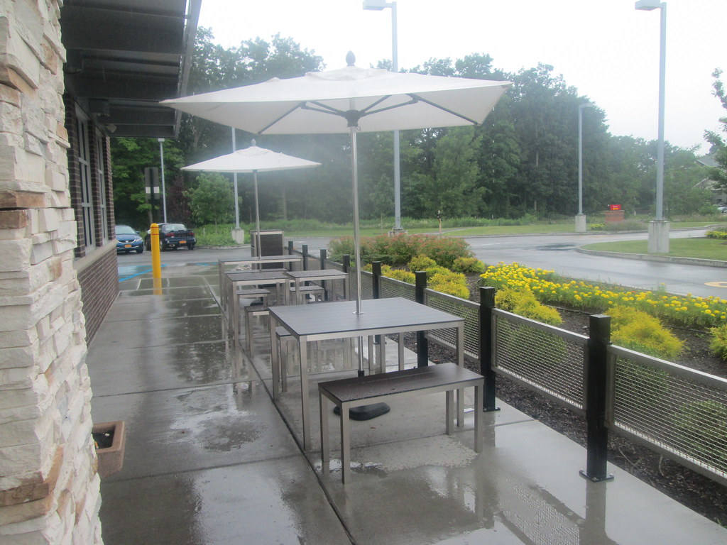
Not an eyebrow to be seen here. Now I like this style of design. Before moving into the interior, here's a closeup of the entrance and another view of the picnic tables.
 |
| Restrooms to the right of the ordering area. |
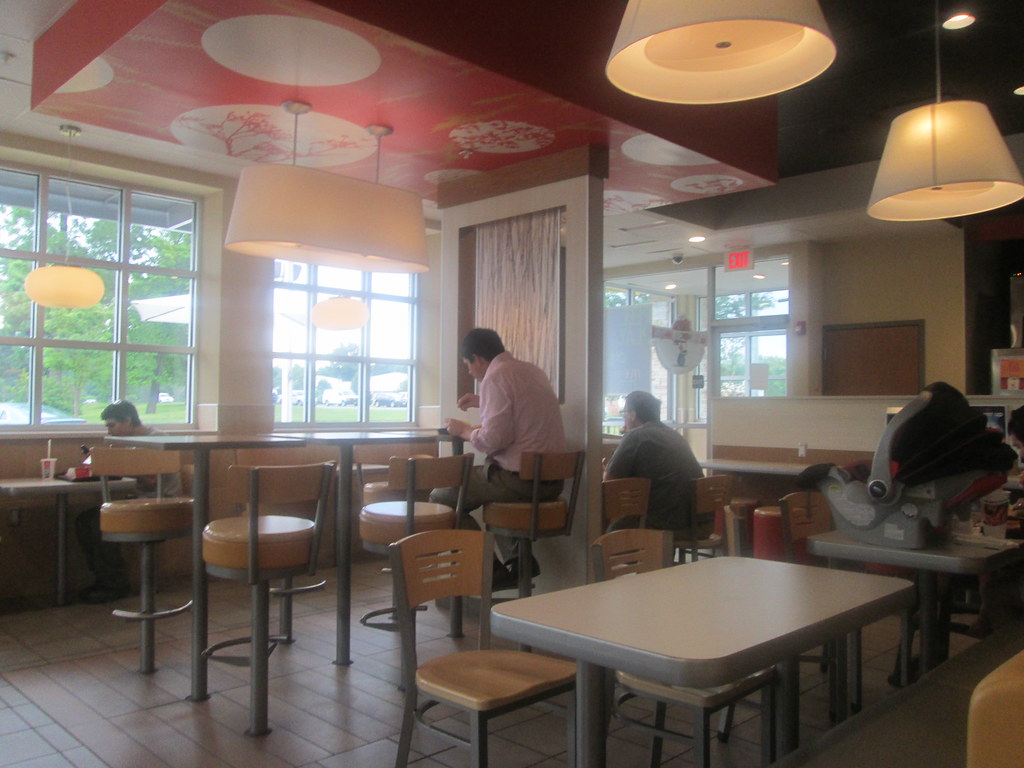
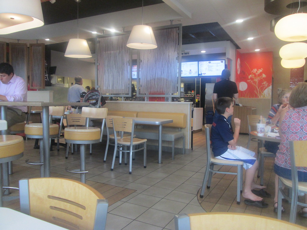
Now for some interesting architecture designs:
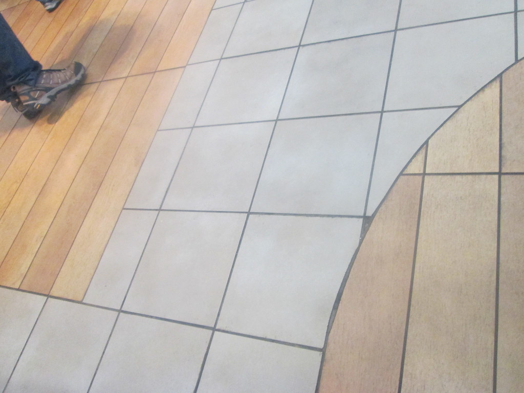 |
| 3 styles of floor tile. The left area with the shoe is for the menu area. The center bit serves as a walking path; and the right is for the seating areas. |
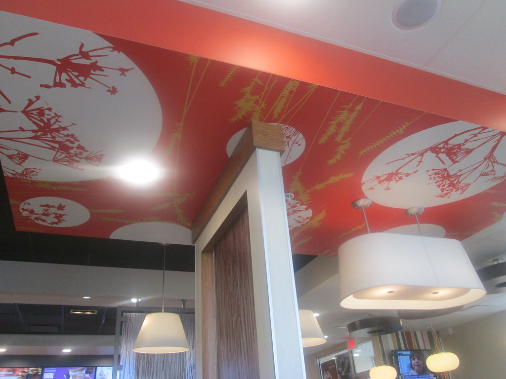 |
| Ceiling details. |
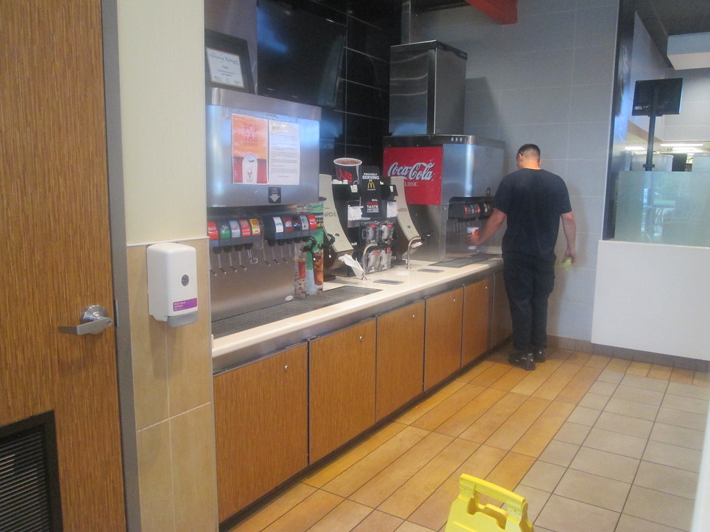 |
| Soda fountains. |
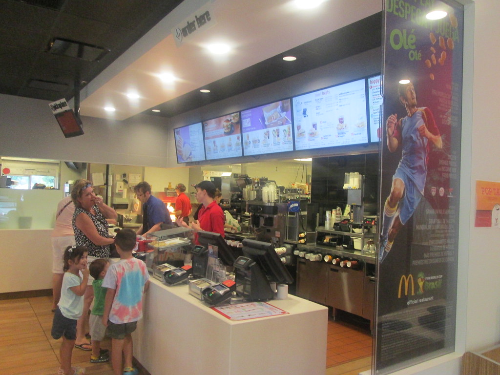 |
| Modern menu set-up. |
I leave this post with a rather interesting sight:
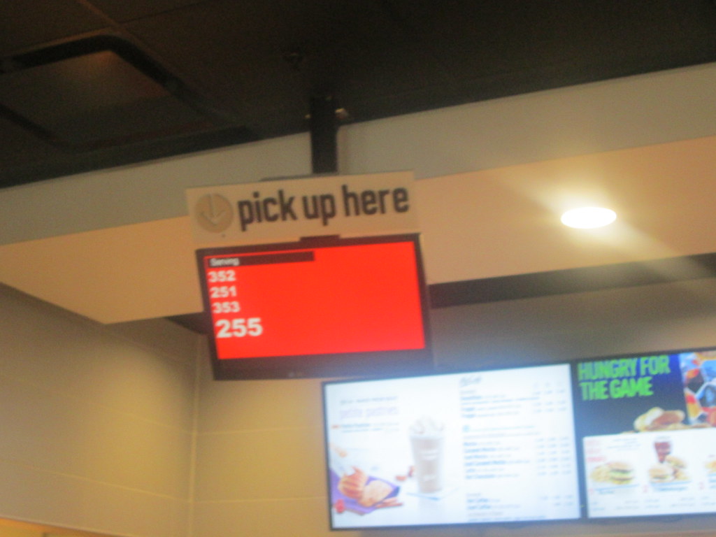 |
| Apparently ordering can get quite hectic since the orders may jump a hundred numbers or so at a time! |


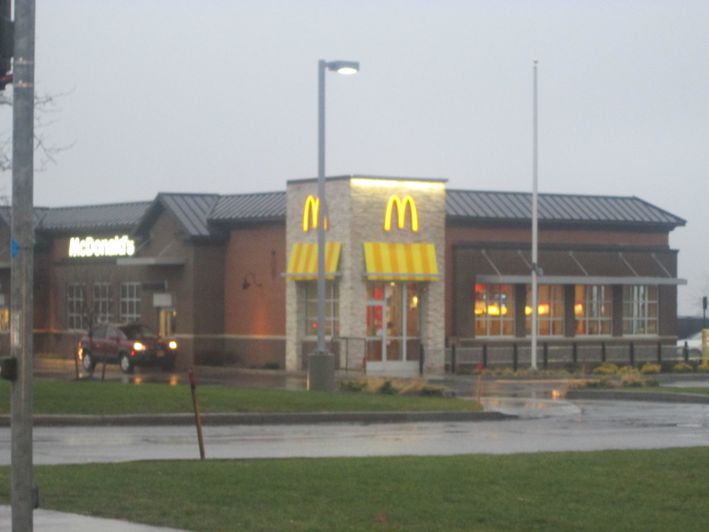

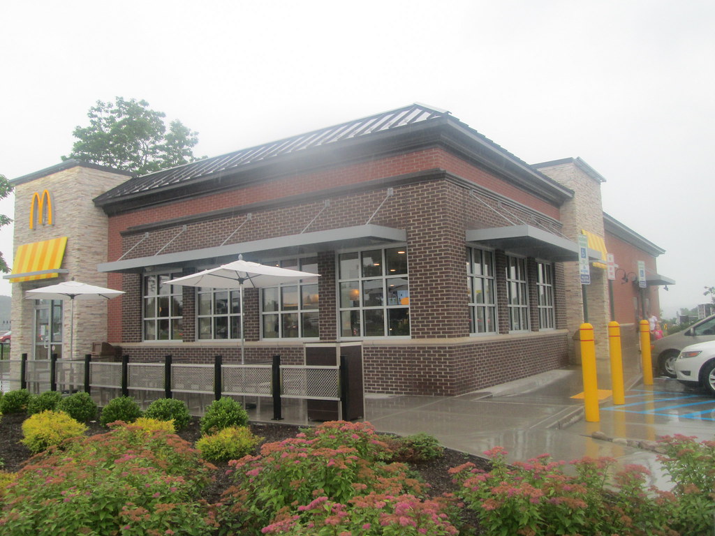
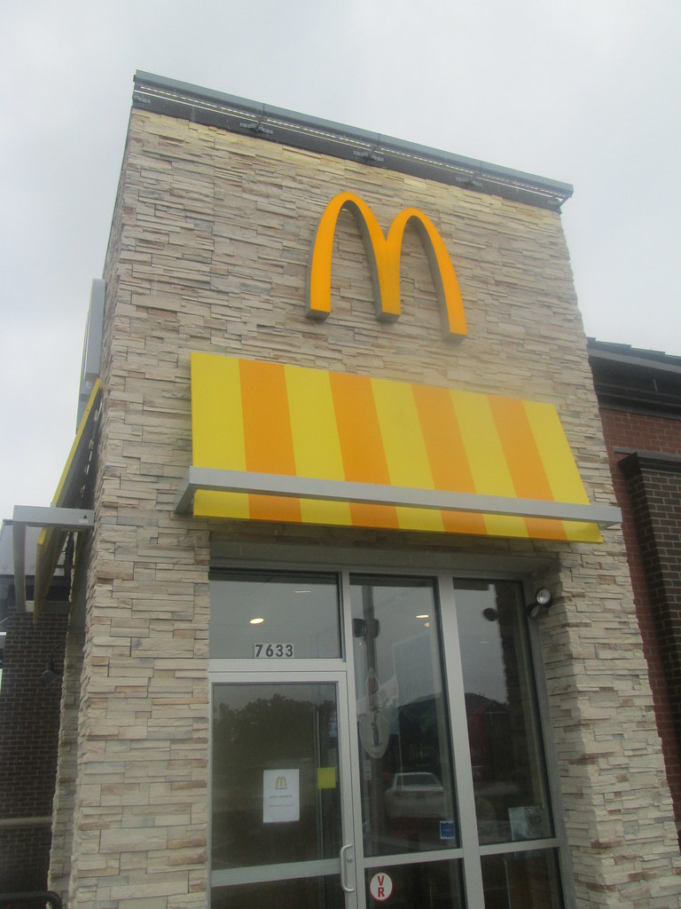

Neat design! I'm a fan of McDonald's without eyebrows, as you know :P
ReplyDeleteI, too, like this design
ReplyDeleteRegarding the order number scheme, I wonder if one set is for dine-in & one for carryout...
ReplyDelete@Retail Retell
ReplyDeleteI think we all do!
@Ryan D
That seems like the most logical thing. Still funny that customers can see both then.