-------------------------------------------------------------------------------------------------------
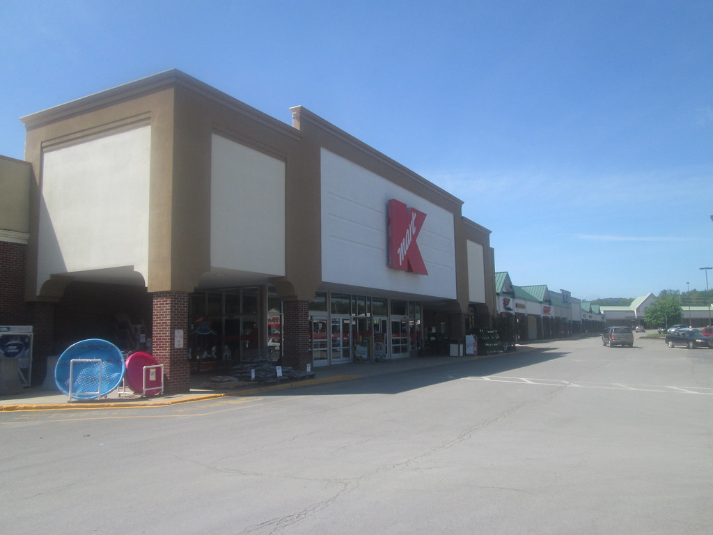
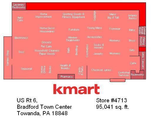
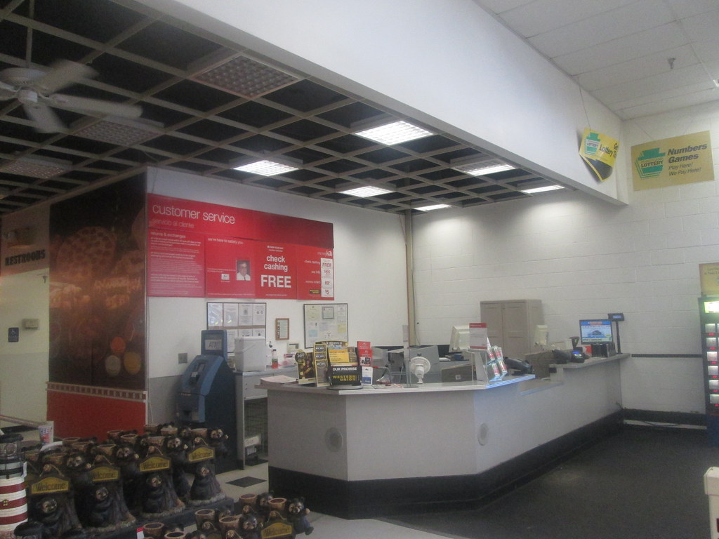
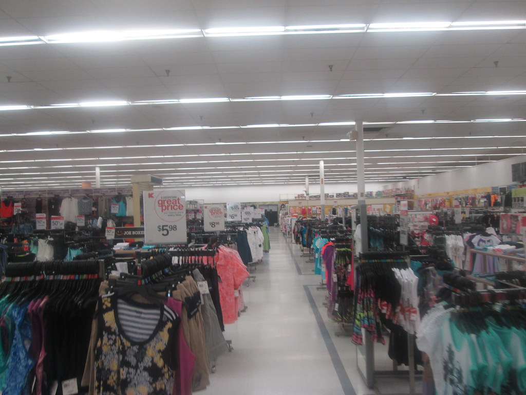
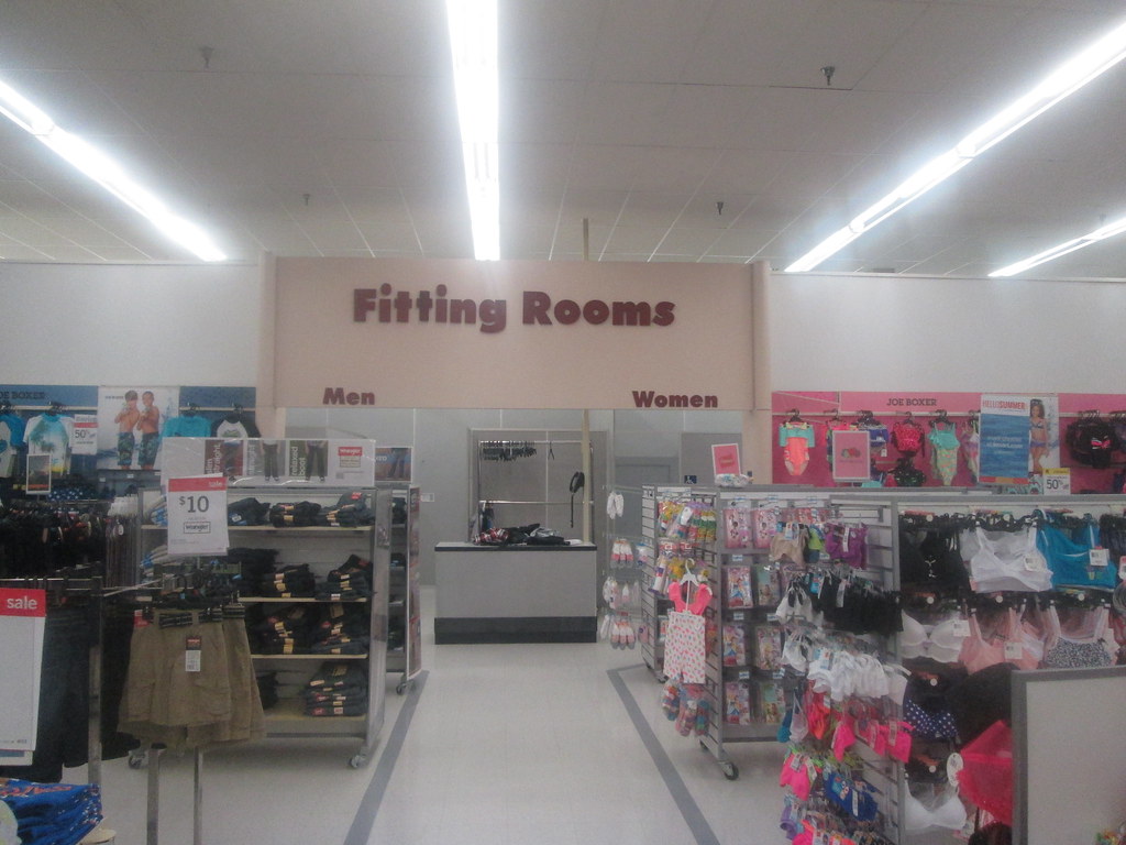
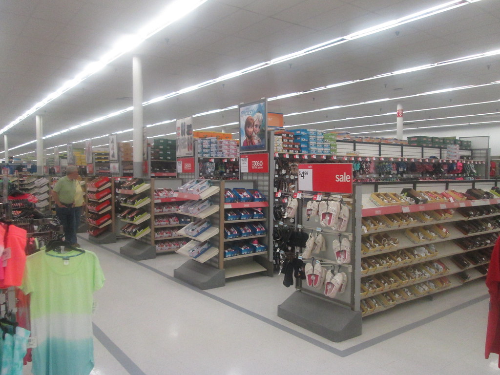
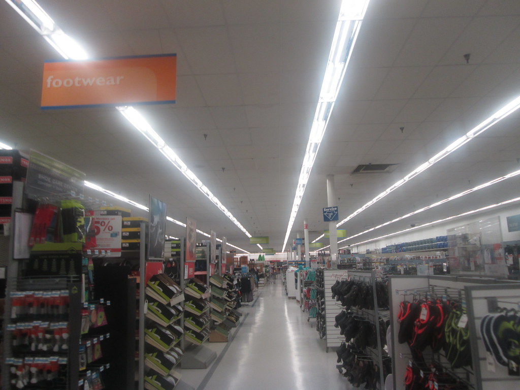
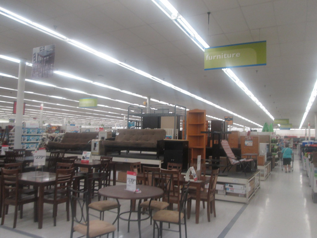
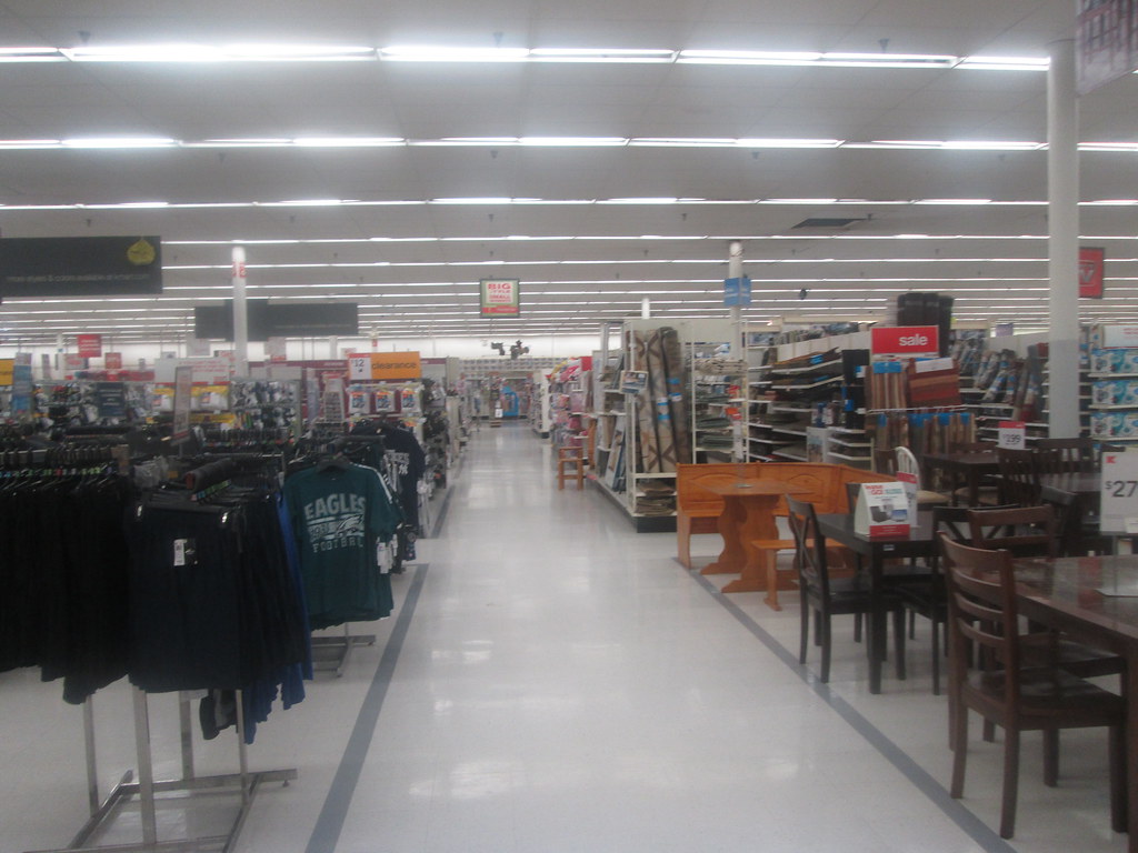
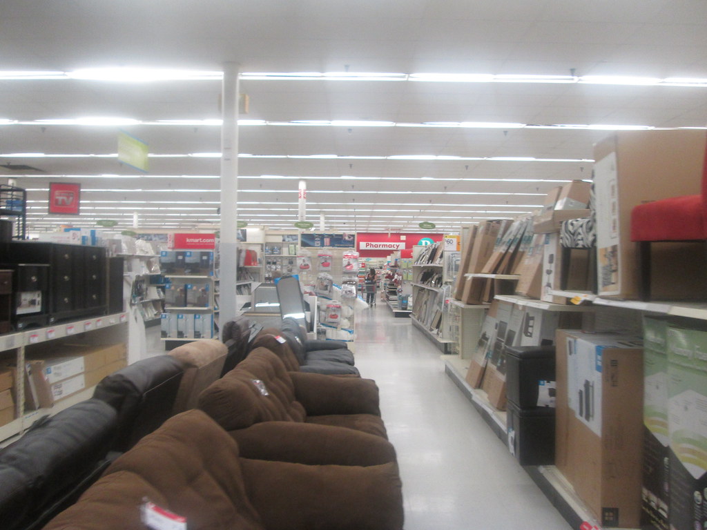
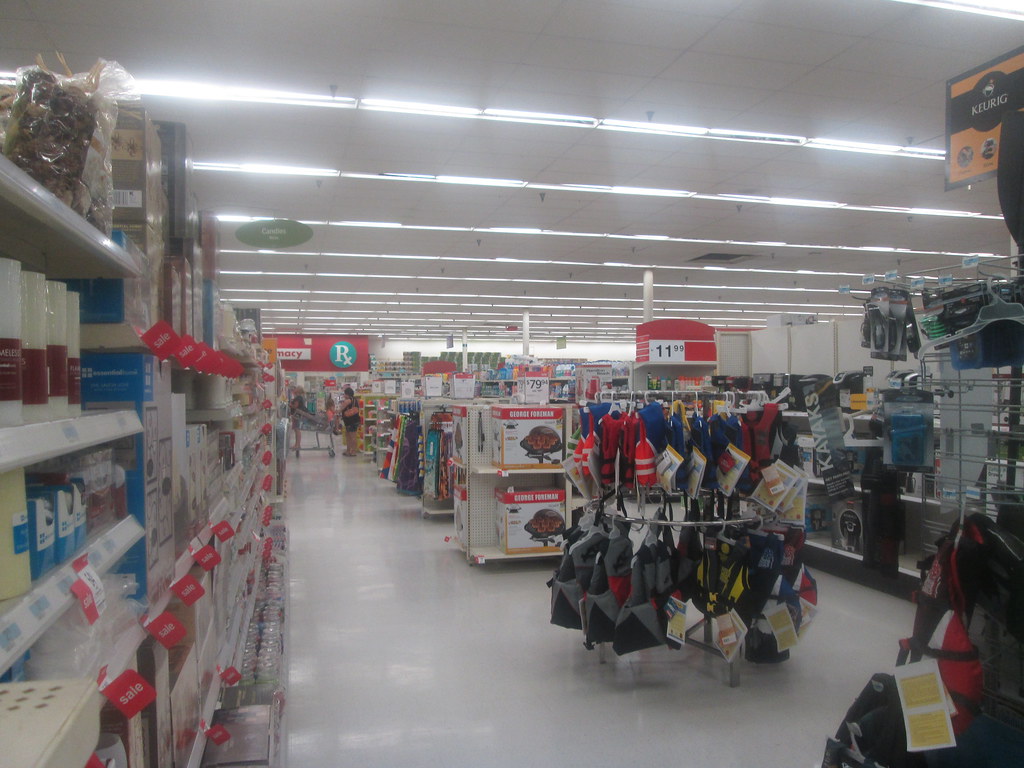
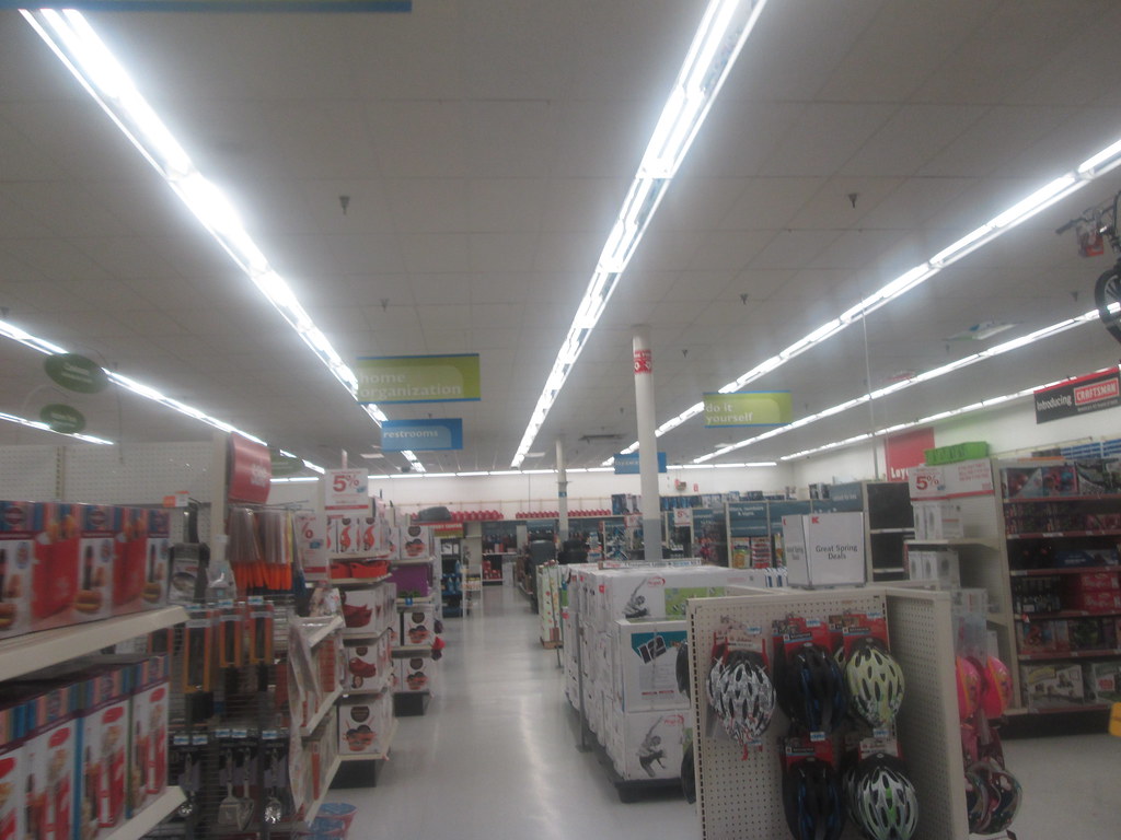
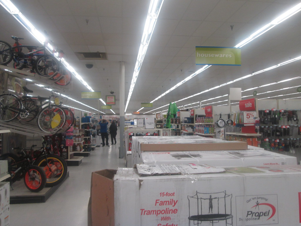
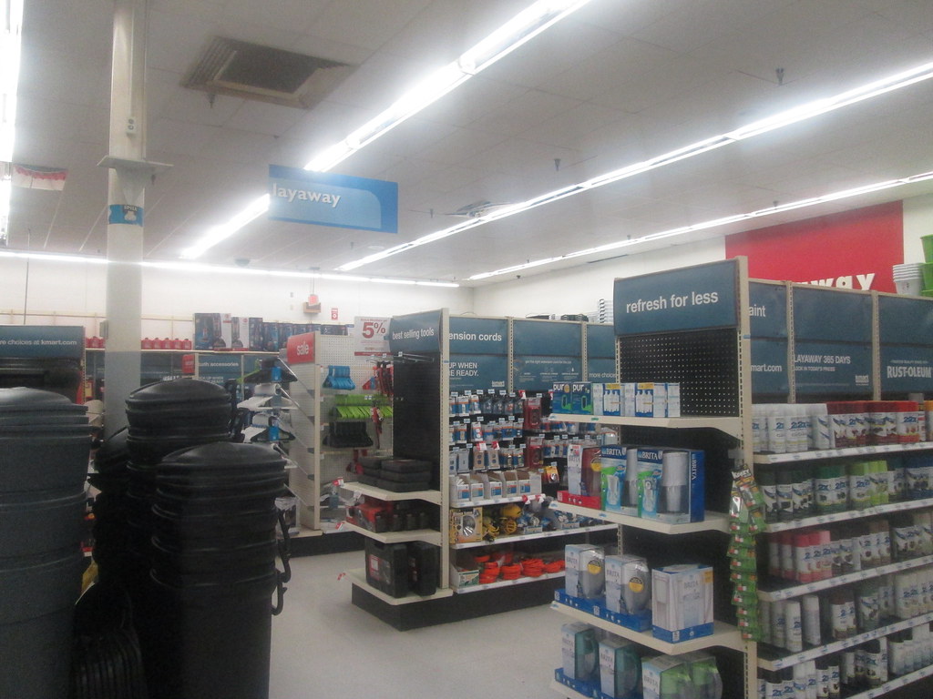
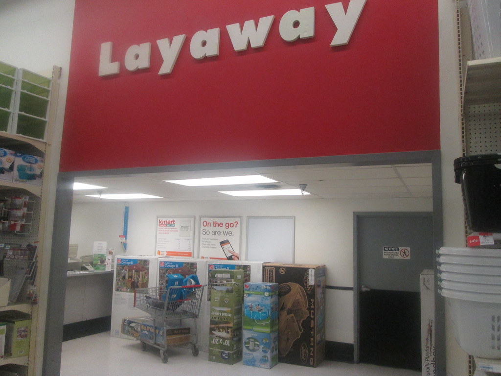
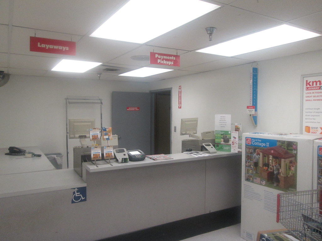
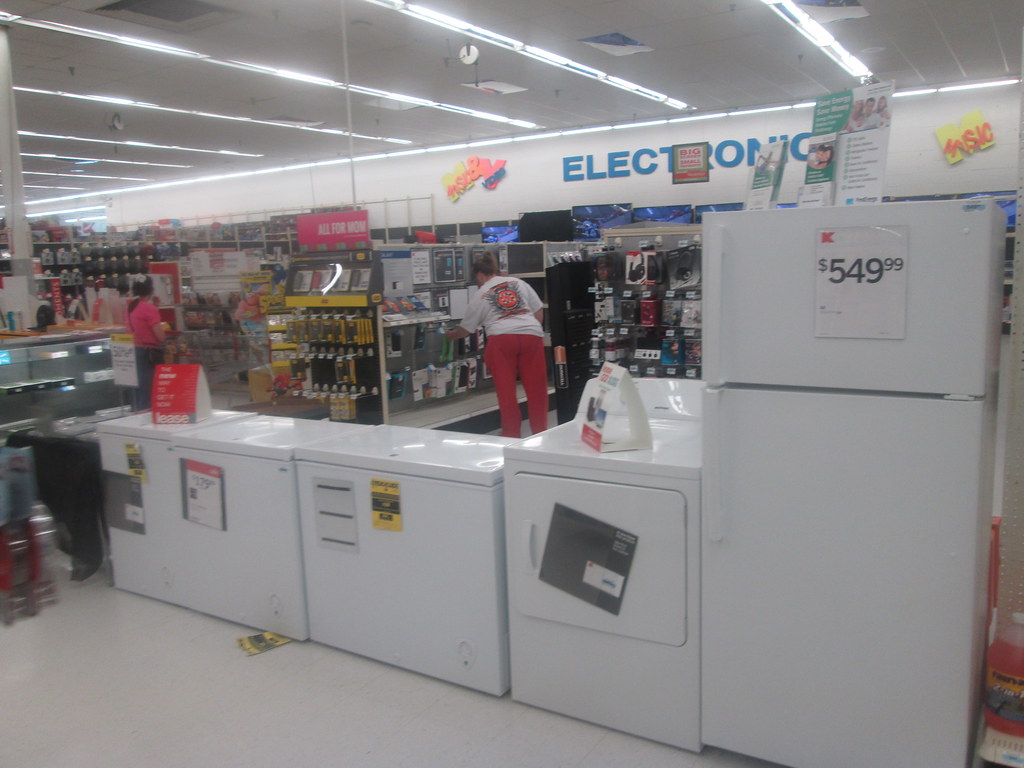
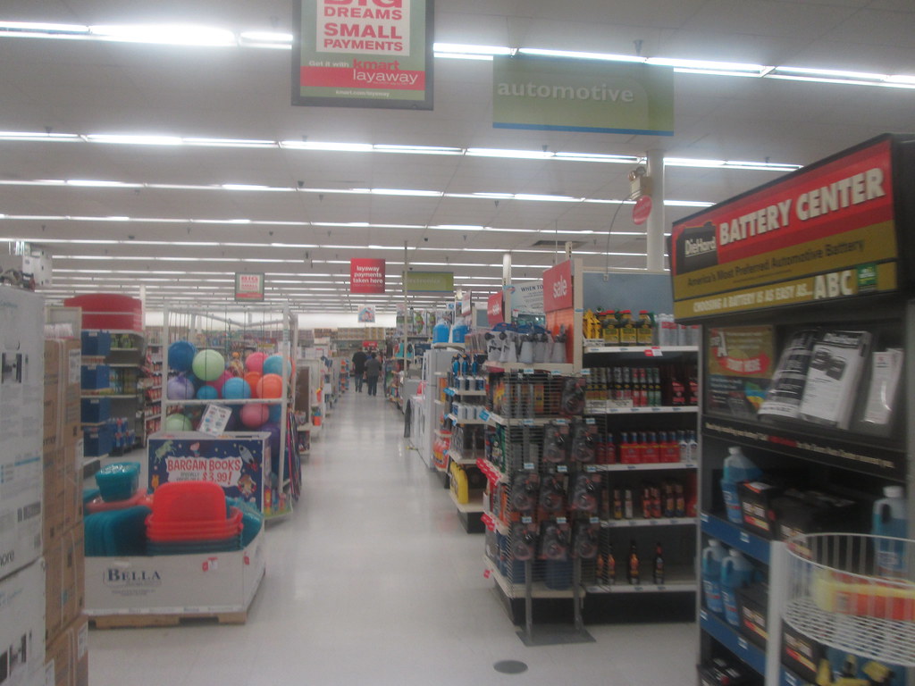
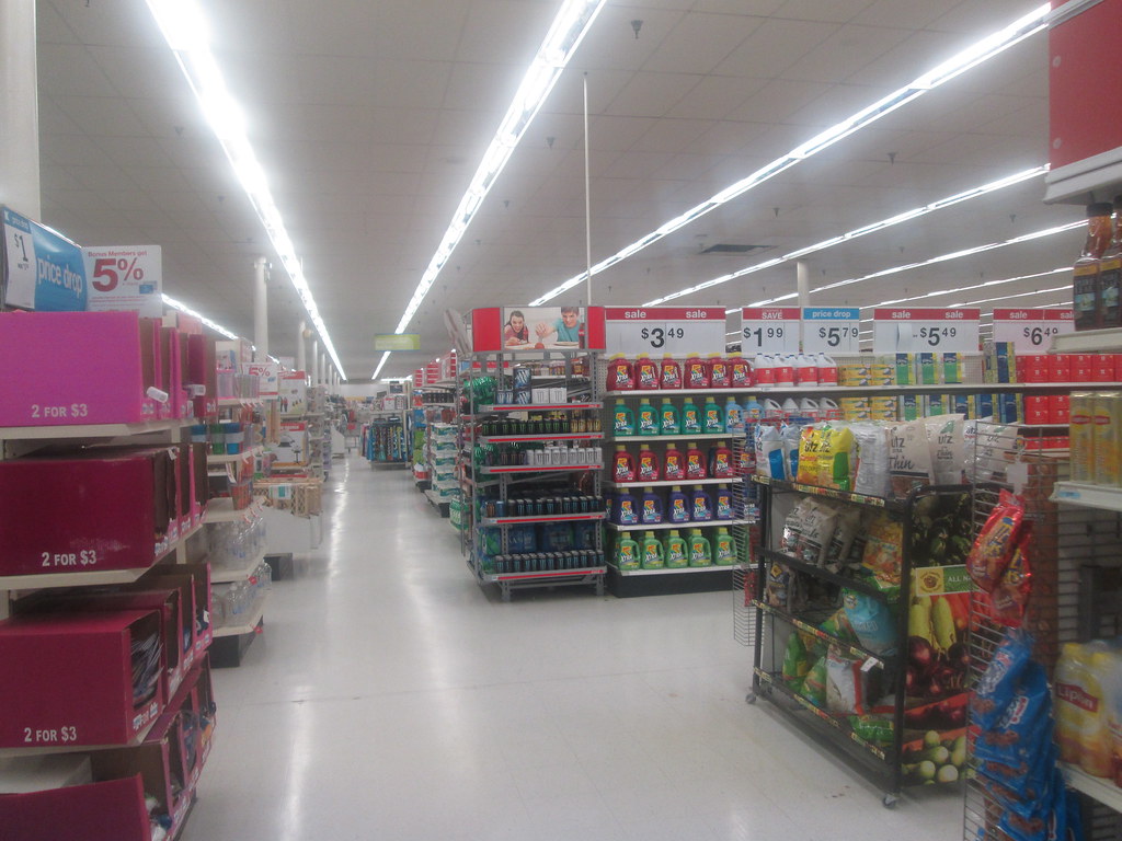
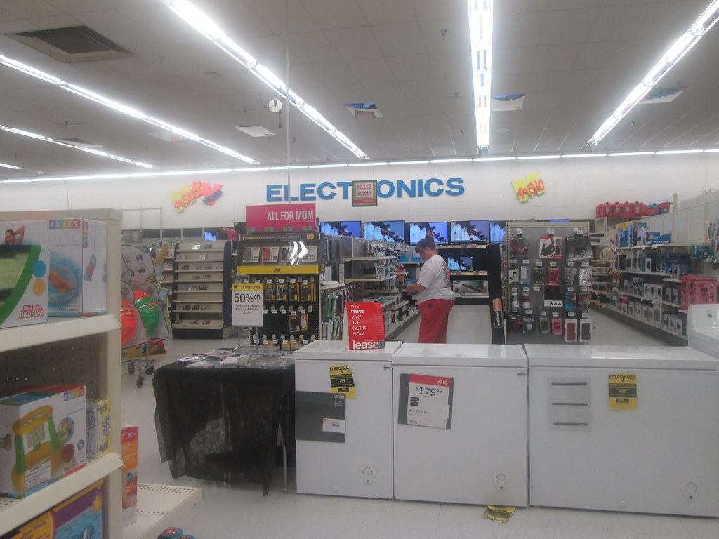
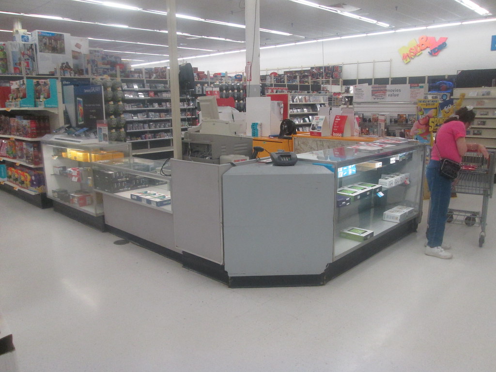
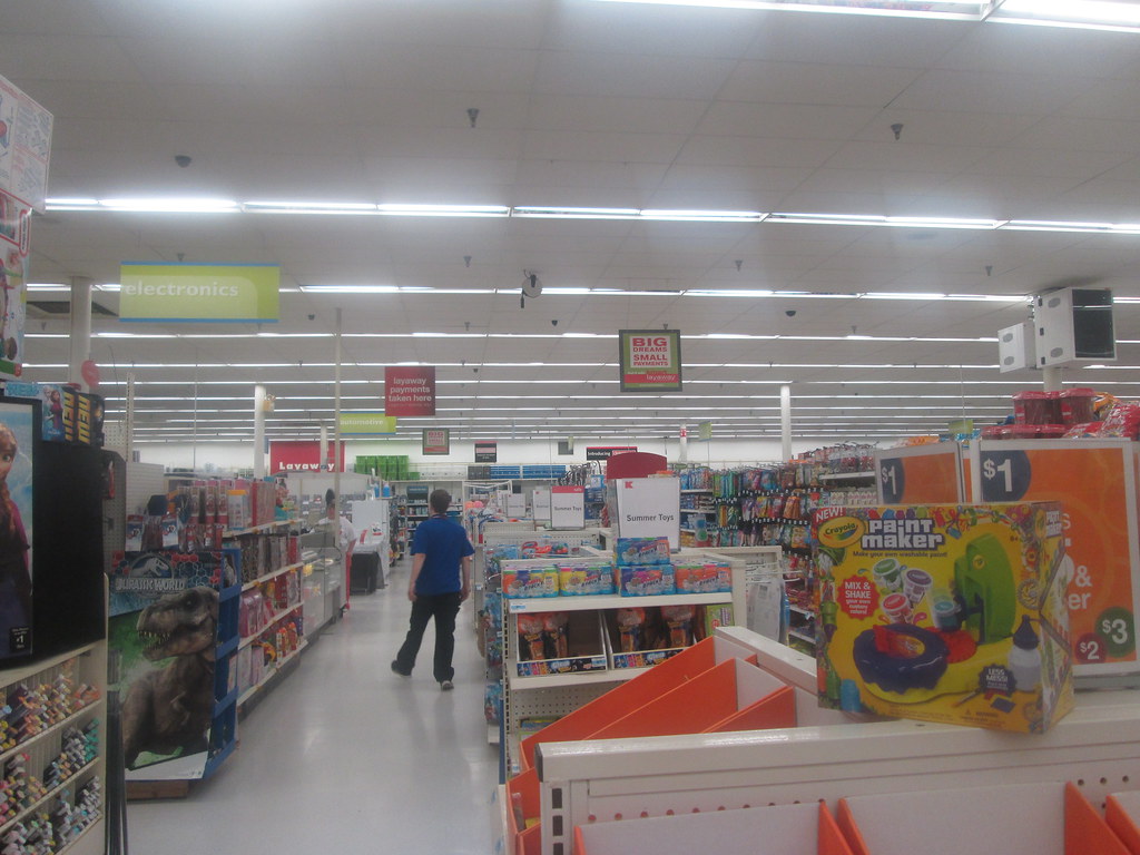
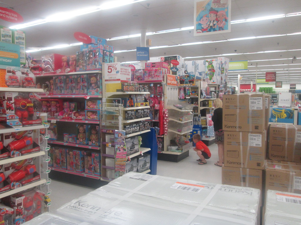
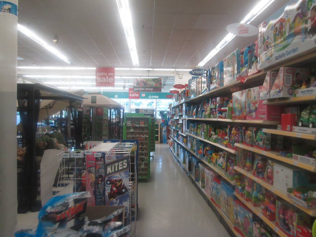
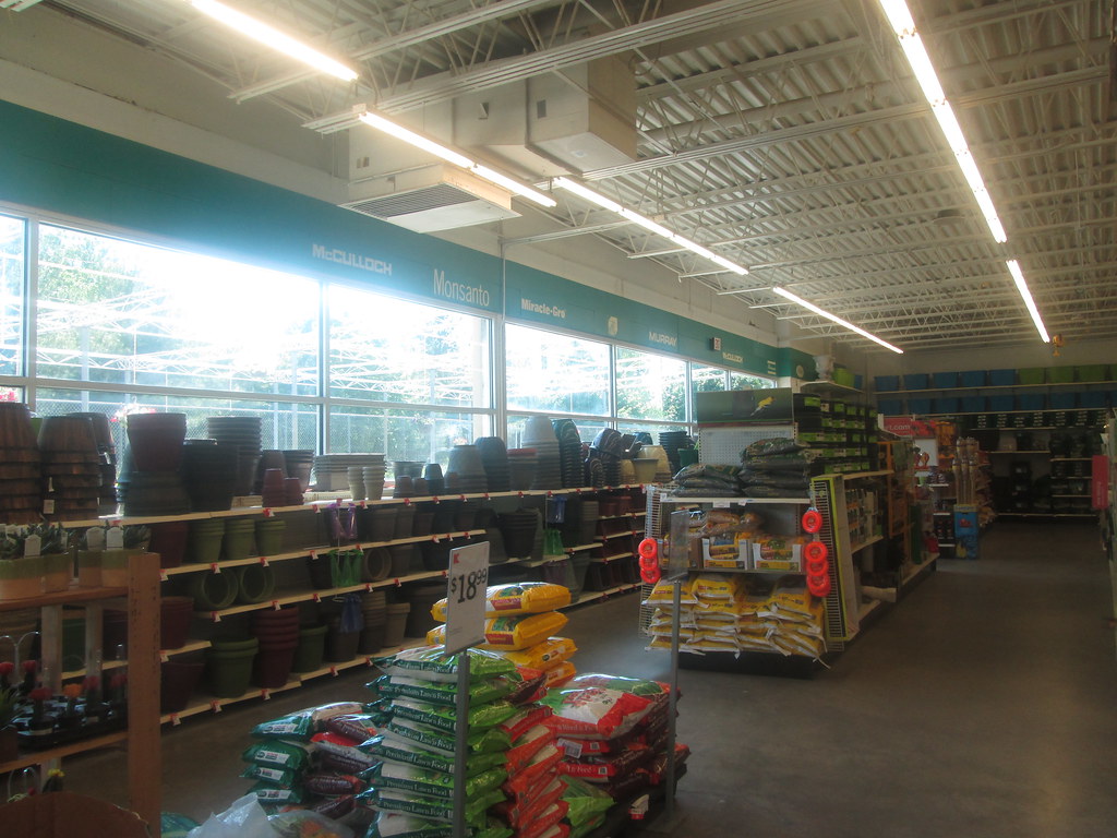
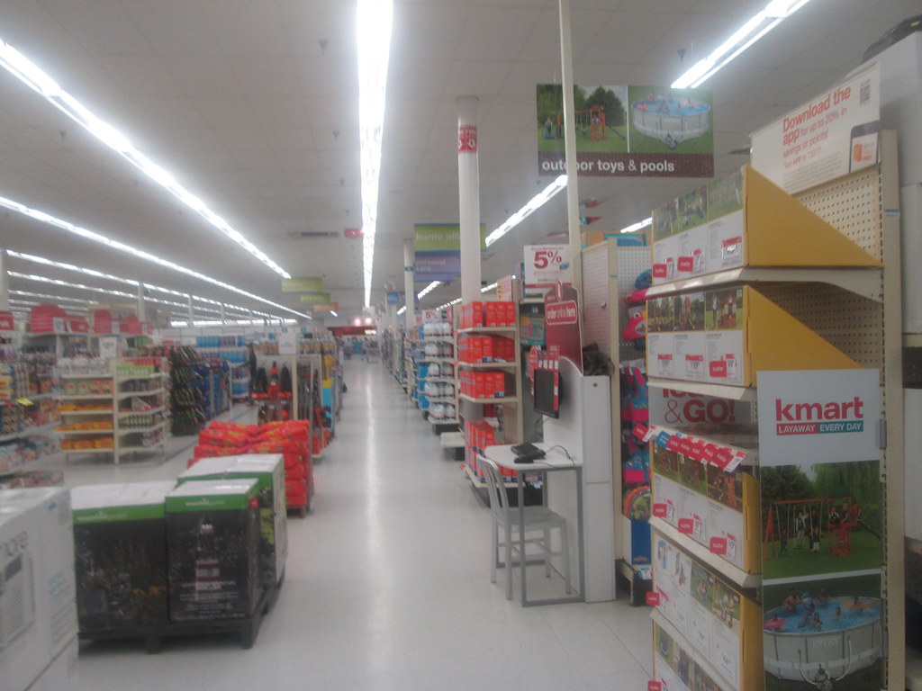
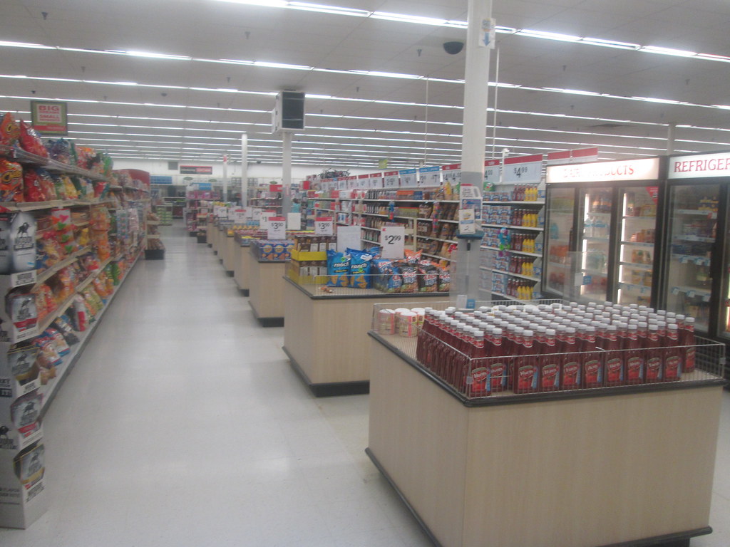
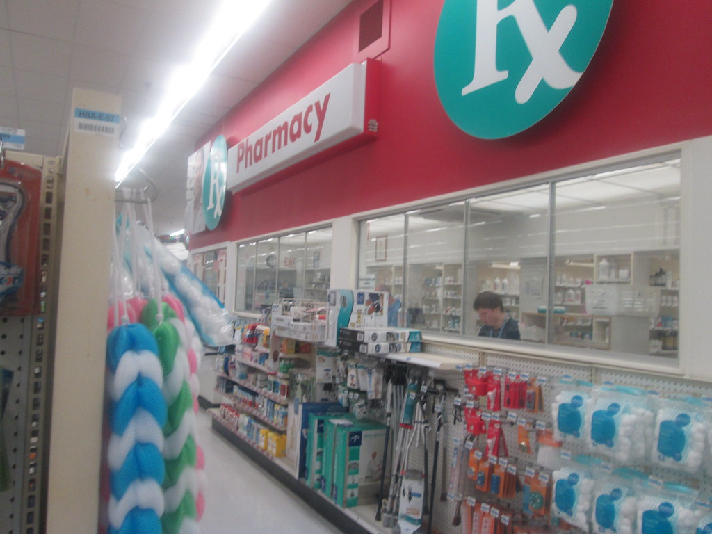
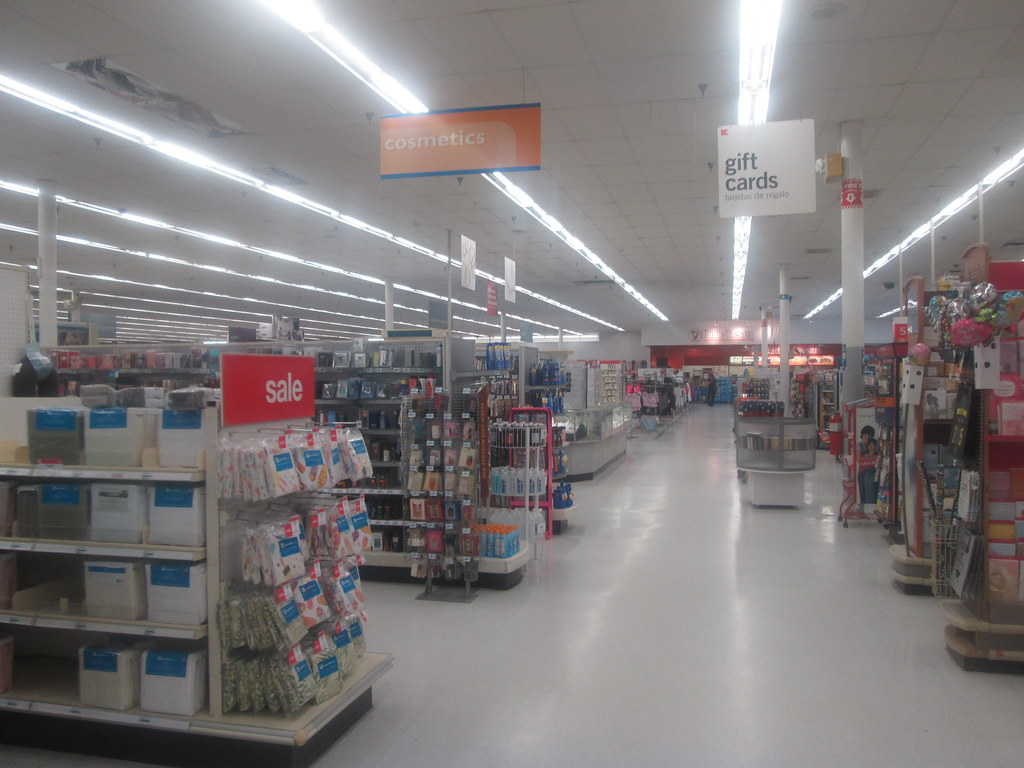
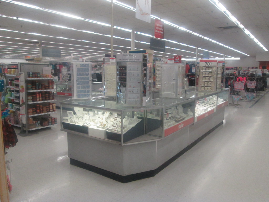
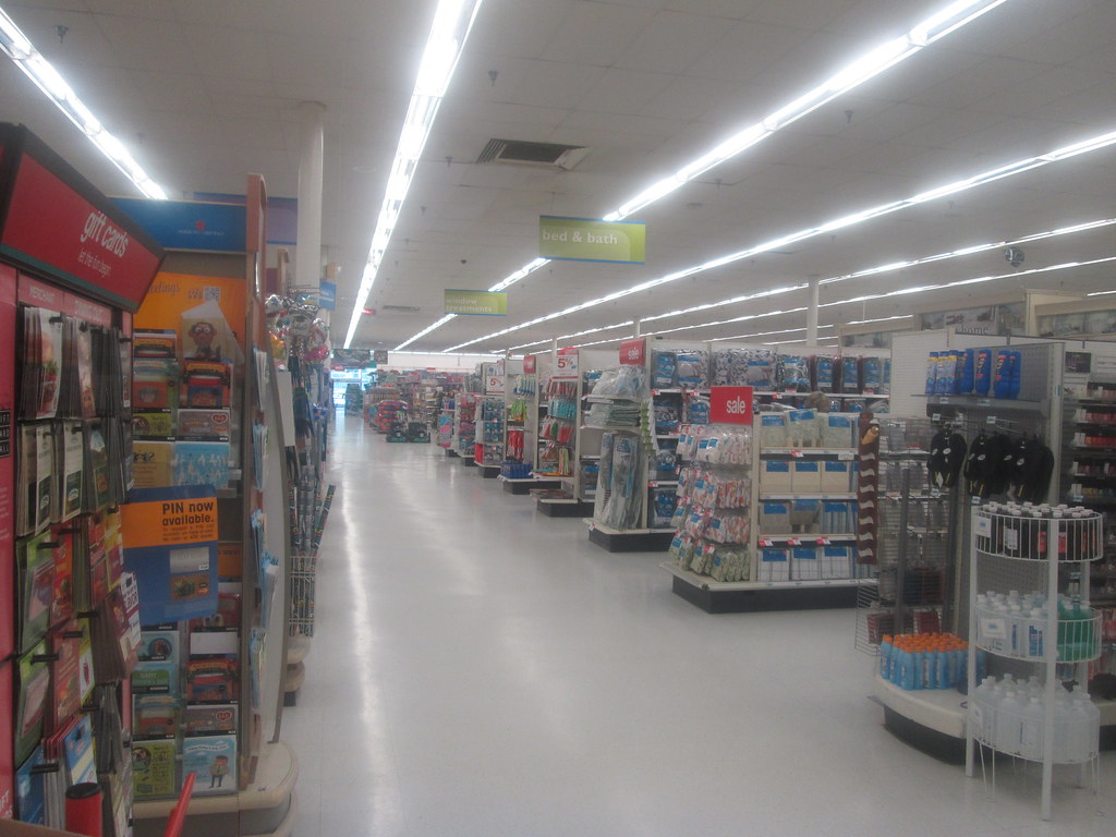
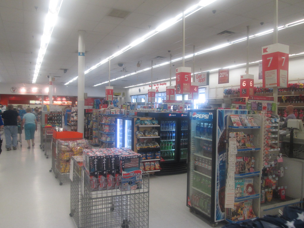
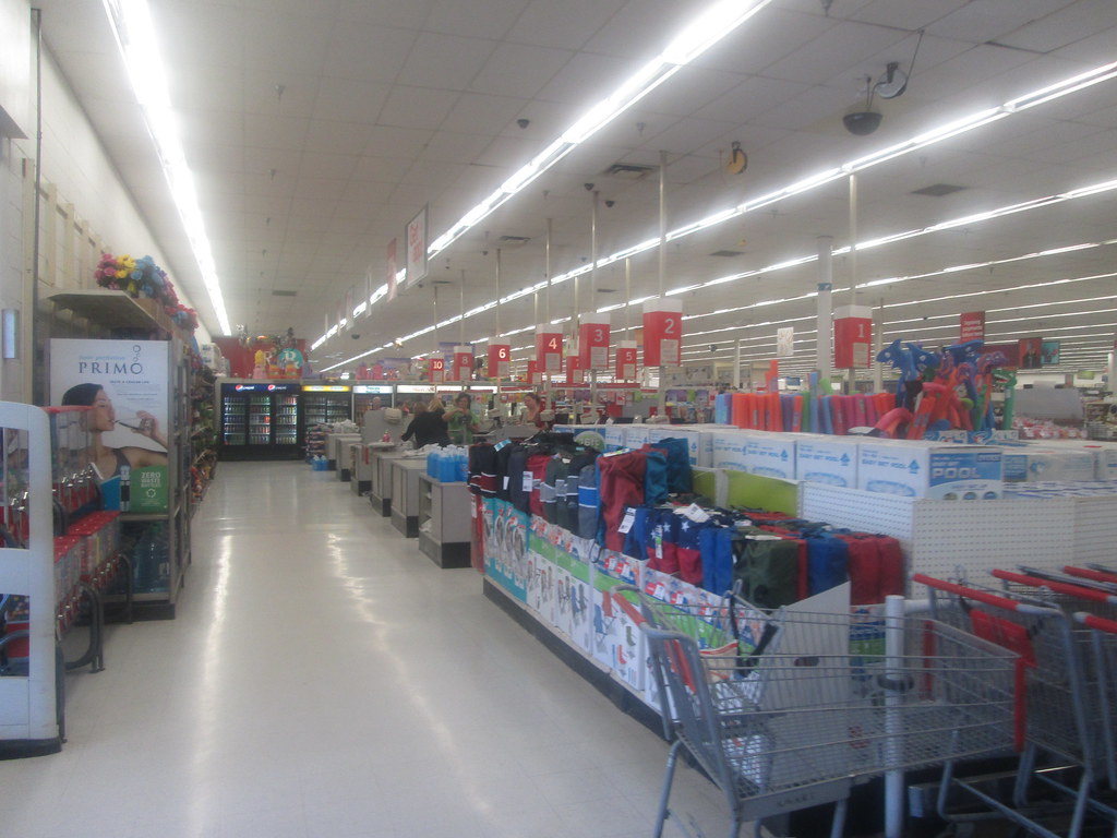
This month's Kmart is a typical '90s built store, so there really isn't a whole lot to say about it. I'll just let the pictures talk for me:
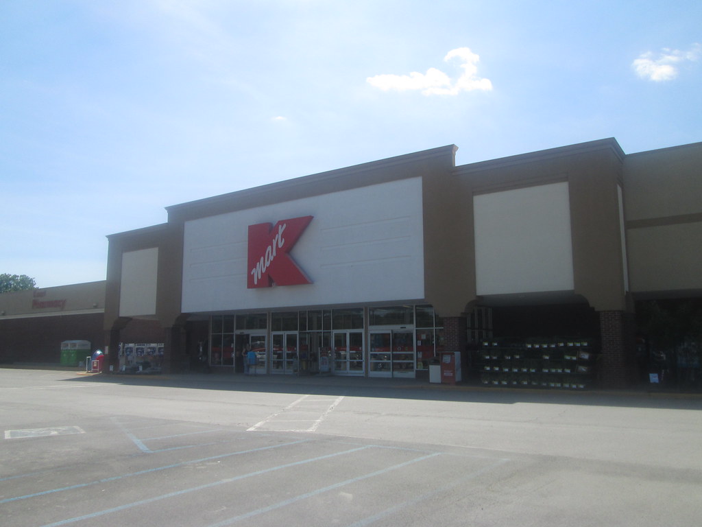 |
| The front facade is the only thing different from other '90s stores exterior wise. |
 |
| Only store I've seen this sign at. |
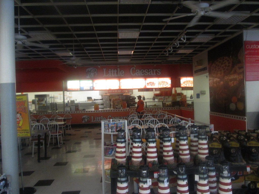 |
| I assume the reason Little Caesars was darkened as it wasn't open yet. |
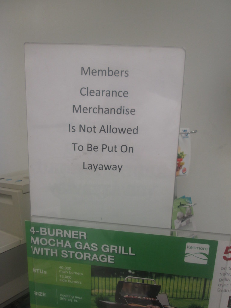 |
| Someone must of tried this.... |
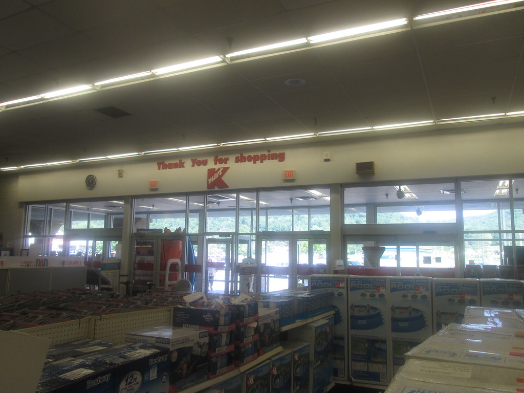 |
| Interesting that there is no 'Big K' logo here. |
Rating: 10 out of 10.
The store is clean, well organized and even has a Little Caesars.
In Danger of Closing?: Unlikely. This store has no competition in the immediate area and I saw plenty of customers despite having visited during the late morning hours.









I didn't get a single post up in February, so you're doing better than I am ;) I liked this one, though! Love the exterior.
ReplyDeleteThanks! This one was nice overall.
DeleteAnyone out there. I also have a blog about Stores/Restaurants closing. Visit my blog.
ReplyDeletehttp://retailsclosing.blogspot.com
DeleteNice blog focusing on the closing side of retail. I will add that to my sidebar.
Delete