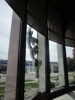
KFC entered the Painted Post, NY market earlier this year in a rather unique way. Instead of building a new location, they actually wound up reusing a bank! In this day and age where most brands want cookie-cutter designs, it is a breathe of fresh air to see a corporate company reuse a building like this. While some interior work did obviously need to happen to accommodate KFC's needs, the structure itself remains mostly the same on the exterior other than a new paint job. Even if local codes were involved in forcing KFC to essentially make do with the existing structure, I have to give KFC a lor of credit for thinking outside the box to get a restaurant in this community.
 |
| Pictures of the building as a bank are courtesy of Google Maps streetview. |
 |
| I couldn't help but find the sight of only being able to see one side of the colonel's face to be amusingly creepy. |


The bank building itself was pretty unique with the round glass lobby design, and that design makes for a very nice fast food restaurant too. The high ceiling and all the windows make for a nice dining room. With all the blandness in fast food restaurant design these days, it was nice to see this refreshingly unique conversion for a change. I also liked how a sketch of the building was incorporated into the interior artwork as well - a nice touch!
ReplyDeleteYeah, they really did a fantastic job reusing the building.
DeleteWow, very cool!
ReplyDeleteIt sure is!
Delete