 |
| Road sign along US 15. Notice that the specials sign is actually unconnected to the McDonald's sign. |
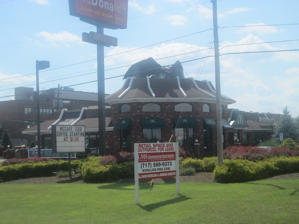 |
| There's even a dragon on the roof of the playground! 1 |
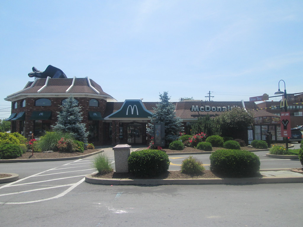 |
| Double lane drive-thru that customers must walk through. |
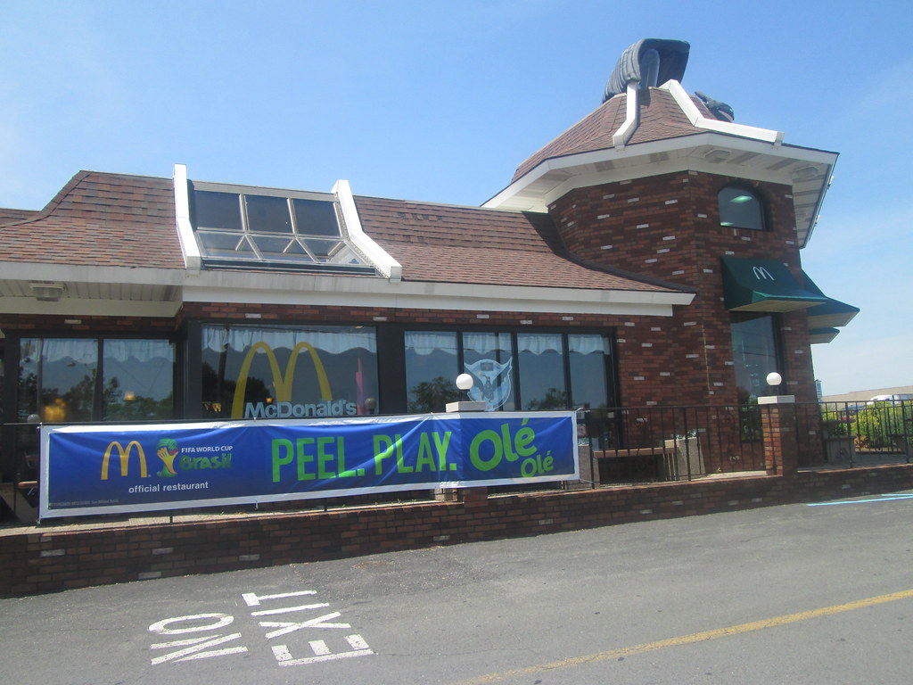 |
| The skylight is for a special interior feature which is seen below: |
 |
| A close up of the 'tower' playground with its guard. |
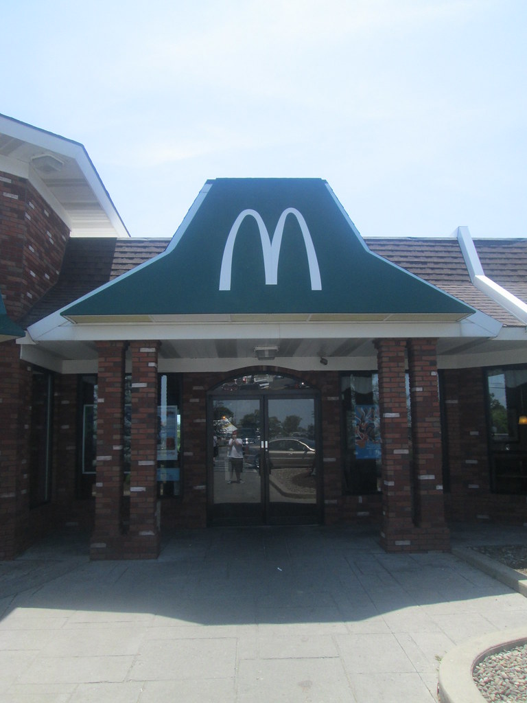 |
| Green arches Entrance. |
 |
| Wide open entryway. |
 |
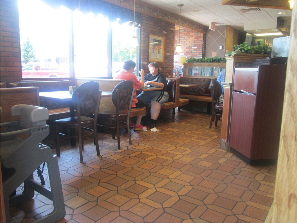
| Looks like someone else is fascinated by the interior as well. |
 |
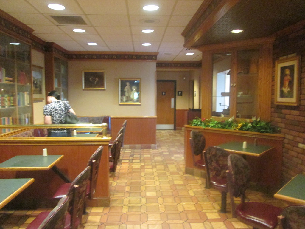
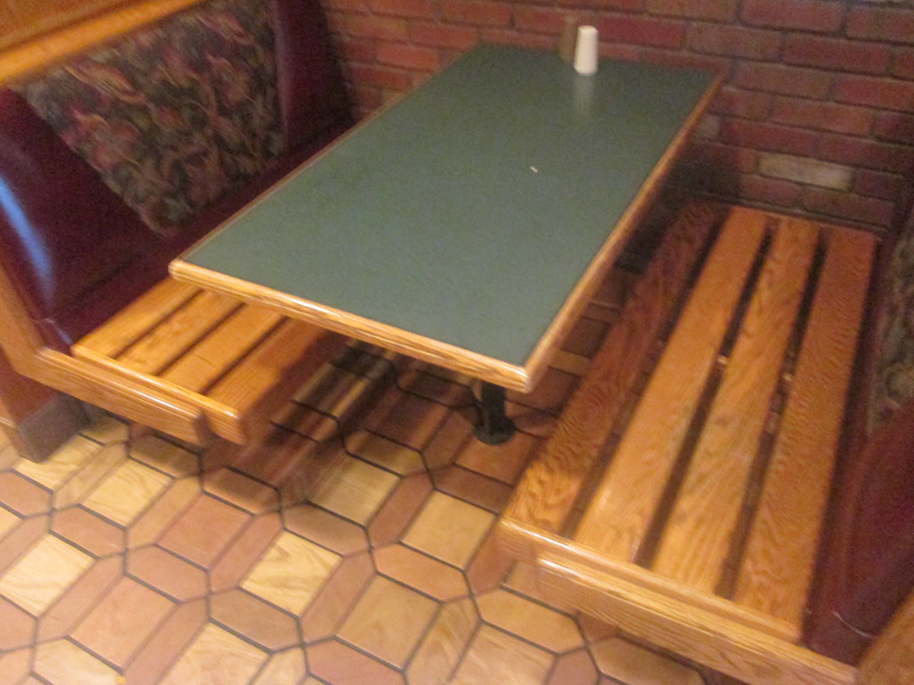
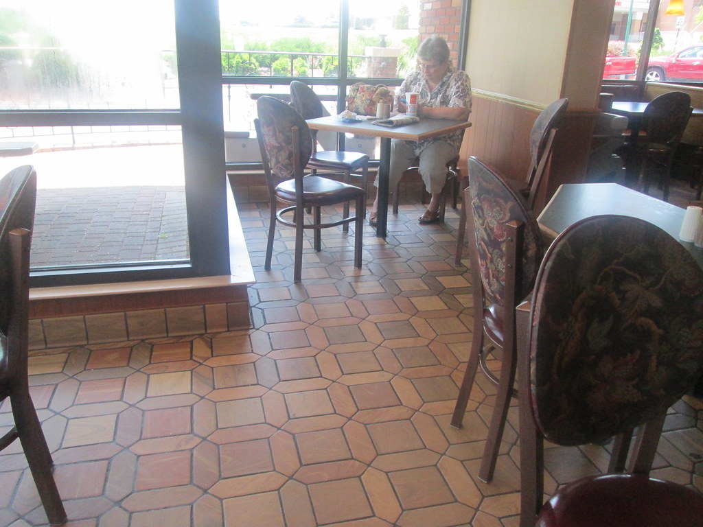
| Fancy tile in addition to the classic McDonalds tile! |
 |
| Fake book covers used as decoration. |
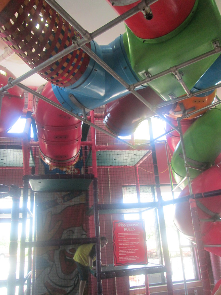 |
| Ronald's playplace.... |
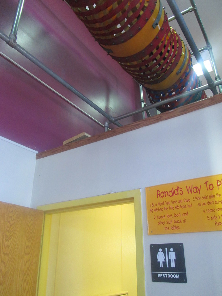 |
| ....even has a separate restroom within it. |
1. The dragon on the roof is here due to the fact that at the time these pictures were taken, McDonald's was offering happy meal toys for one of the How to Train A Dragon movies.


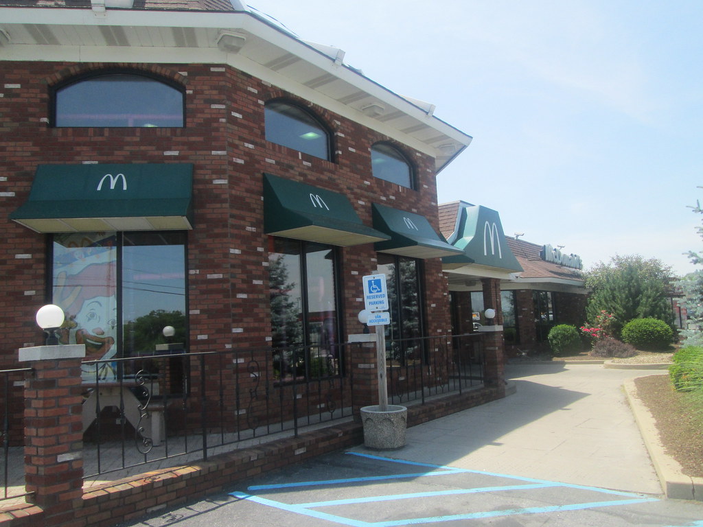
Woah! What a super cool McDonald's! I love the tower, interior decorations, stained glass light, skylight... all of it! I hope they keep their hands off of this one for a long time to come...
ReplyDeleteI remember when they used to do inflatables at these sorts of places as part of the kids' meal toy promotions (heck, maybe they still do, but I haven't seen any lately). In fact, my grandmother once sent me a picture from her local paper of a giant SpongeBob on top of a Burger King! Thanks for bringing back the memory :)
And is it just me, or does the awning over the main entrance here look a bit like the Pizza Hut roof?
As do I! I would hate to see this one go!
DeleteYour welcome for the memory. It does have a Pizza Hut resemblance.
Classy indeed! Such a shame that uniqueness is no longer celebrated :( Glad to see this one is around and I hope it stays that was for a long time!
ReplyDeleteAnd I agree, the entrance awning is strikingly similar to the Pizza Hut roof in its shape.
Yeah, that's one thing I hate about various company's designs. They no longer think having a unique location is desirable. I guess they think if doesn't look like how it is supposed to, then people won't know it is their store/restaurant.
DeleteThis is probably the classiest McDonald's I've ever seen. McDonald's would never spring for stained glass pieces or fancy architectual detailing these days. Keep that eyebrow away from this one!
ReplyDeleteI'm not sure many companies would go for that kind of detail these days. I sure hope the yellow brow of doom never comes here!
Delete